Send the prompt, the criteria and whatever data set you have been handed, and a premium original sample returns inside 24 to 48 hours with each figure defined before it is interpreted, the arithmetic verified by a second reader, and revision at no cost until the guide is met. This one appears on the transcript as EDD FPX 8050, Data Literacy for Leaders, worth 2 program points, one of the five doctoral core courses in the Capella EdD with the Educational Leadership specialization, taken in FlexPath inside a required 32-point sequence. In Capella's catalog the course code is written EDD-FPX8050.
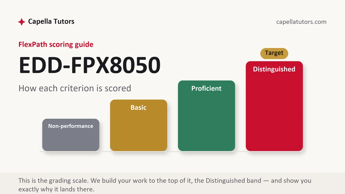
What EDD FPX 8050 actually grades
The first thing scored here is whether you know what a number in a school building actually counts. Every figure in education carries a definition, a cohort and an interval, and leaders lose arguments because they quote the figure without any of the three. The four-year adjusted cohort graduation rate is the standard illustration: its numerator is students earning a regular diploma within four years of entering ninth grade, and its denominator is that entering cohort adjusted upward for transfers in and downward for verified transfers out, which is why a school with heavy mobility can post a rate that has almost nothing to do with the quality of its teaching. Ellen Mandinach and Edith Gummer argued in Educational Researcher in 2016 that data literacy is a distinct professional skill rather than a byproduct of assessment knowledge, and this course is written on that premise. State what the measure is before you say what it means, every time.
The second graded strand is the difference between status, growth and gap, and the criteria are unforgiving about it. Status tells you where students stood on one day. Growth tells you how far the same students moved between two days, which is a different question with a different answer, and schools ranked on one routinely change places when ranked on the other. Percentage proficient is the most misleading of the three because it is not really a measure of learning at all. It counts how many students crossed a single line, which makes it exquisitely sensitive to how many students happened to be sitting just below that line and completely blind to movement anywhere else in the distribution. A grade can improve substantially for its lowest readers and post an unchanged proficiency rate, and a paper that reports the rate alone will conclude that nothing happened.
Disaggregation and small numbers form the third strand. Averages conceal, so the criteria expect subgroup reporting, and subgroup reporting immediately runs into the arithmetic of small denominators, where three students moving can swing a rate by fifteen points. Minimum reporting sizes exist to keep individual children unidentifiable, and they are a privacy protection rather than an inconvenience. Alongside that sits measurement error, which most district conversations ignore entirely: an individual test score is an estimate with a band around it, so placing a student in an intervention because they scored two points below a cut treats a difference the instrument cannot reliably detect as though it were real.
The fourth strand is what happens to a number once decisions depend on it. Donald Campbell put the warning most memorably in 1979 when he argued that the more any quantitative indicator is used for social decision making, the more subject it becomes to corruption pressures and the more apt it is to distort the processes it was meant to monitor. Every leader in education has watched a version of this: attention concentrating on students near the cut, referrals reclassified, a metric improving while the thing it stood for does not. The American Statistical Association issued a related caution in 2014 about value-added models, noting that teacher effects account for a modest share of variation in scores and that estimates for individual teachers are unstable across years. Citing both, rather than either the enthusiasm or the cynicism about data, is what a top-column paper does.
How we help in this course
Every figure in an 8050 draft arrives defined, sourced and accompanied by its count. Rates come with the number of students behind them, comparisons come with the group being compared, trends come with enough points to be a trend, and any subgroup too small to report honestly is described rather than quietly dropped. If your deliverable includes a data display, we build it so the axis starts where it should and the comparison sits on the same chart instead of in an adjacent paragraph. Send the spreadsheet or the report you were given, along with your role and the audience you are writing for.
Delivery works the same way it does across the catalog. A premium original sample in 24 to 48 hours, written against the top descriptor in the guide you were issued, checked by eight readers with one doing nothing except recomputing every percentage in the document and confirming the totals agree, and free revision until the criteria are met. Faculty feedback is absorbed at no charge.
The assessments, one by one
Assessment 1
Assessment 1 of EDD FPX 8050, Data Literacy for Leaders, is graded on whether you know what your numbers count. Read the full Assessment 1 manual.
Assessment 2
Assessment 2 of EDD FPX 8050 puts the analysis in front of people who will act on it. Read the full Assessment 2 manual.
Assessment 3
Assessment 3 of EDD FPX 8050 asks what happens to a number once decisions ride on it, and what routine would keep it honest. Read the full Assessment 3 manual.
How to actually write EDD FPX 8050: where to begin
Build from the guide, then decide the question your data is answering before you decide the display. The failure mode in this course is a well-formatted report of numbers with no argument attached, and the second failure mode is an argument attached to numbers whose definitions were never stated. Convert each criterion into a heading, keep the top descriptor visible while you draft, and require every table or figure in the document to earn its place by answering a question you asked in the text. The assessments in this course usually ask you to interpret a data set for a leadership audience, to identify what it can and cannot support, and to recommend an action tied to what you found, and your scoring guide decides the format and the depth.
Then work one interpretation all the way through, because the arithmetic teaches faster than the concept. A grade of 180 third graders sits against a reading cut score of 440. Last spring 79 of them reached it, a proficiency rate of 44 percent. This spring 92 reach it, which is 51 percent, and the headline writes itself as a seven-point gain. Now look underneath. The mean scale score moved from 431 to 434, a rise of three points, on a test whose standard error of measurement is around eight. The reason a three-point average shift produced a seven-point jump in the rate is that 31 students were clustered between 430 and 439 last spring, packed just under the line, so a small general improvement carried 13 of them across it. The students scoring below 400 rose by the same three points and are counted exactly as they were before. The sentence to write is that the proficiency rate measured how many children were near the cut rather than how much reading improved across the grade, and that both figures should be reported together with the distribution behind them.
Then do the same discipline on a subgroup, since equity criteria live here. Of 18 students with disabilities in that grade, 5 were proficient last spring, which is 27.8 percent. This spring 8 of 19 are proficient, which is 42.1 percent, and a district newsletter will call that a fourteen-point gain. Three students moved. With a denominator that small, one student is worth more than five percentage points, and a single enrollment change alters the figure without any child learning anything. The honest write-up gives the counts first and the rate second, declines to draw a trend line through two points, checks the minimum reporting size your state applies before publishing anything at all, and looks instead at the students individually, which with nineteen children is entirely feasible. Pair that with the causal caution set out in EDD FPX 8040, because a rate that moved is not yet a program that worked.
| Section | What goes in it | What Distinguished looks like |
|---|---|---|
| What the measure is | The definition, the cohort it covers, the interval, the source system, and who produced it. | A definition precise enough that a reader could recompute the figure from the raw file. |
| Baseline and comparison | Prior periods, a peer or district figure, and the direction of travel across enough points to be real. | A trend of several periods rather than this year against last, with the comparison on the same axis. |
| Disaggregation | Results by the groups that matter locally, with counts shown alongside every percentage. | Small denominators handled openly, with reporting limits respected rather than quietly ignored. |
| Status, growth and distribution | Where students stand, how far they moved, and how the scores are spread around any cut. | The rate, the mean and the distribution reported together, with the cut score effect explained. |
| Interpretation and limits | What the data supports, what it cannot support, and the measurement error around individual scores. | An explicit statement of the decision this evidence is not strong enough to justify. |
| Action, routine and references | The decision proposed, who reviews the measure and how often, and current APA throughout. | A recurring review routine with an owner, rather than a one-time presentation of findings. |
Developing the analysis
Analysis in this course means moving from a number to a defensible decision, and the literature on data use is clear that the step is organizational rather than technical. Kathryn Boudett, Elizabeth City and Richard Murnane built the Data Wise process around that insight, sequencing preparation, inquiry and action so that a team examines evidence before it debates solutions, which is the opposite of how most meetings run. Cynthia Coburn and Erica Turner argued in 2011 that data use is a practice shaped by routines, norms and who is in the room, which explains why identical dashboards produce serious inquiry in one building and defensive summaries in another. Use those two together in your analysis. Say what the data shows, then say what would have to be true of your organization's routines for anyone to act on it, then propose the routine rather than the dashboard. A recommendation that specifies who looks at which measure, how often, and what decision is on the table each time is worth more than any additional statistic, and it is the move that separates a leadership paper from a report.
Citations that survive faculty review
Four source families carry this course. Conceptual claims about data use belong to their originators, so cite Mandinach and Gummer in 2016 for data literacy as a distinct capability, Boudett, City and Murnane for the improvement process, Coburn and Turner in 2011 for the organizational view, and Campbell in 1979 for the corruption of indicators under pressure. Technical claims about tests belong to measurement authorities, principally the Standards for Educational and Psychological Testing issued jointly by the American Educational Research Association, the American Psychological Association and the National Council on Measurement in Education, which is the document to cite on reliability, standard error and appropriate use of a score. Definitions and reporting rules come from the sources that set them, meaning federal collections through the National Center for Education Statistics and your own state education agency's reporting handbook, and quoting the state definition of a rate is far stronger than paraphrasing it. Your own district reports and dashboards are legitimate evidence when you cite them as documents and say what system produced them. Format in the seventh edition of the APA manual, and confirm that every percentage in the paper still agrees with its counts after your last edit.
The mistakes that land Basic instead of Distinguished
- A rate quoted with no count behind it. Forty-two percent of a group of nineteen is three students, and a reader who cannot see that is being misled.
- Two points called a trend. This year against last year is a comparison, and about half the time it is measuring noise rather than change.
- Proficiency treated as achievement. A cut score counts crossings, so a grade can improve everywhere except near the line and appear completely static.
- Individual scores used as though they were exact. Placing a child by a two-point difference ignores the error band the test's own documentation publishes.
- Findings with no routine attached. A presentation that ends at the data leaves the decision criterion with nothing to score.
EDD FPX 8050 questions students actually ask
Should I report percent proficient or average scale score?
Report both, because each hides what the other shows. A proficiency rate is easy to explain and answers the accountability question your board is already asking, but it counts only students who cross one line and is therefore most sensitive to whoever happened to be sitting just below it. An average scale score reflects movement anywhere in the distribution, including for students far above and far below the cut, but it means nothing to an audience with no feel for the scale. The pairing that actually informs a decision is the rate, the mean, and a picture of the distribution showing how many students sit within a few points of the cut on either side. If you have room for one more number, add the share of students in the lowest band, since that group is invisible in a proficiency rate and is usually the reason you are meeting.
What do I do when a subgroup is too small to report?
Respect the suppression rule and then find another way to see the students. Minimum reporting sizes exist to protect identifiable children, and publishing a rate for a group of nine defeats that protection whatever your intentions. What you can do is combine years so the group is large enough to speak about, report counts rather than percentages when the count is the more honest figure, aggregate across a category where that makes educational sense, or move to a measure the small size does not destroy, such as a case review of every student in the group. Never treat a suppressed cell as an absence of a problem. Say in the paper that the group exists, that reporting rules prevent a rate, and how you examined it instead.
How do I present data to a board without oversimplifying?
Give them one number to remember, one comparison that makes it mean something, and one sentence about what it cannot tell them. The failure mode is not simplification, it is unaccompanied simplification, where a single rate arrives with no baseline and no uncertainty and becomes a decision within ten minutes. Show the trend rather than the point, because a board reading one year against the prior year is reading noise about half the time. Put the comparison group on the same axis instead of describing it in words. State the count behind every percentage. And when you are asked whether a program worked, answer with what the data can support and then say what evidence would be needed to answer the question they actually asked.
Data interpretation due?
Send the prompt, the criteria, and the file you were handed. The first premium sample is free, and every figure in it is defined before it is used.