This manual is for EDD FPX 8050 Assessment 1, start to submission. Assessment 1 of EDD FPX 8050, Data Literacy for Leaders, is graded on whether you know what your numbers count. The assessment usually asks you to interpret a data set for a leadership audience, say what it supports and what it cannot, and recommend something the evidence actually licenses. What follows is the order our tutors read a data set in, the section plan the criteria expect, and an annotated interpretation. Prefer to hand it off? A premium original sample is back inside 24 to 48 hours and revised at no charge for as long as the guide requires. Capella's catalog lists the course as EDD-FPX8050, and some courserooms print EDD8050; both point to this same Assessment 1.
One honesty note before the manual: Capella revises courses and scoring guides over time, so always write to the exact scoring guide attached to your assessment in the courseroom. The course identity above is verified on capella.edu; the method and structure below are our tutors' approach to it, not Capella's official rubric text.
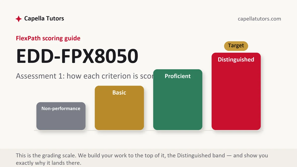
How EDD FPX 8050 Assessment 1 is scored
Criteria are scored at four levels apiece, with no grade on top. On an interpretation deliverable the levels sort themselves by definitional care:
| Level | What it means on a data interpretation deliverable |
|---|---|
| Distinguished | Every figure is defined before it is interpreted, each rate arrives with its count and the distribution behind it, and the paper names the decision this evidence is not strong enough to justify. That refusal is usually the top-column sentence. |
| Proficient | The data is described accurately and the interpretation follows from it. Correct work, a level under work that stated its own limits. |
| Basic | A tidy report of numbers with no argument attached, or an argument attached to figures whose definitions were never given. |
| Non-performance | A required element is absent, most often the counts behind the percentages, or any interpretation beyond restating the table. |
Ellen Mandinach and Edith Gummer argued in Educational Researcher in 2016 that data literacy is a distinct professional capability rather than a byproduct of knowing about assessment, and the criteria here are written on that premise. Say what a measure is before you say what it means, every single time, including the measures everyone in the room believes they already understand.
The EDD FPX 8050 Assessment 1 method, step by step
-
Define the measure before you interpret a thing
What was counted, which cohort it covers, over what interval, and which system produced the file. A figure without those four is not yet evidence. Quote the definition from the agency or vendor that set it rather than paraphrasing, because the paraphrase is where the error usually enters.
-
Put the count in the same sentence as the rate
Forty-eight percent is an argument; 931 of 1,940 is a fact that can be checked. Writing both costs six words and removes the commonest way a data paper misleads a reader who is inclined to trust it.
-
Separate the rate from the number of people it represents
A rate has a denominator that can move on its own, so a rate and a count can travel in opposite directions honestly. When they do, that divergence is the finding, and a paper that reports only one of them has chosen a conclusion rather than reached one.
-
Show the distribution, not only the line-crossers
A threshold counts crossings and is therefore most sensitive to whoever was sitting just below it. Report the mean and the shape of the spread alongside the rate, and say how many cases sit within a few points of the cut on each side, because that number explains most year-to-year movement.
-
Give every figure a baseline and a comparison on the same axis
One year against the prior year is a comparison of two points, and about half the time it is measuring noise. Show several periods, put the district or state series on the same chart rather than describing it in a sentence, and start the axis where it belongs.
-
Write the sentence about what this cannot decide
Name the decision your audience wants to make and say plainly whether the evidence reaches it. Then say what would have to be collected to answer the question they are actually asking. That paragraph is the one thing in the paper that no dashboard produces.
A structure that maps to the criteria
Planning targets for an interpretation of ordinary scope rather than Capella rules; weight the sections your own guide weights.
| Section | What it must do | Guide |
|---|---|---|
| What the measure is | Definition, cohort, interval, source system, and who produced the file. | ~225 words |
| The figures, with counts | Every rate reported beside its numerator and denominator, over its stated window. | ~250 words |
| Baseline and comparison | Several prior periods and an external series, presented on one axis. | ~250 words |
| Rate against count | Where the two diverge, why the denominator moved, and which question each answers. | ~300 words |
| Distribution and thresholds | The spread, the mean, and how many cases sit near the cut on either side. | ~250 words |
| What this cannot decide, and references | The decision the evidence does not reach, and seventh edition APA throughout. | ~175 words |
Annotated sample excerpt
An original interpretation passage from our team, at the level the top descriptor asks for.
Across these eleven high schools, advanced placement registrations rose from 1,180 to 1,940 over three years while the share of exams scored 3 or higher fell from 61 to 48 percent.1 The count of qualifying scores rose across the same period from 720 to 931, which means 211 more students earned a college-credit score in a district whose headline pass rate dropped thirteen points.2 Both figures are correct, they answer different questions, and a board asked to judge this expansion on the rate alone is being handed the one number that gets worse when access improves.3
- 1Puts the two measures side by side with their periods attached, so the apparent contradiction becomes visible instead of arguable.
- 2Converts a rate into students, which is the move that changes what a board can honestly conclude from the same file.
- 3Says what the rate is for and what it is not for, without implying that anyone reported it dishonestly.
The full premium sample for your exact assessment, written fresh to your scoring guide and issue, is free to request. Study it, revise it into your own voice, and submit work you understand.
The five mistakes that cost Distinguished
- A rate quoted with no count behind it. Forty-two percent of nineteen is eight cases, and a reader who cannot see that is being misled by arithmetic.
- Two points called a trend. This year against last year is a comparison, and roughly half the time it is noise wearing a direction.
- A threshold treated as the outcome. A cut score counts crossings, so a group can improve everywhere except near the line and appear static.
- A definition paraphrased rather than quoted. The state's own wording for a rate is free to copy, and paraphrasing it is where most reporting errors begin.
- No sentence about what the data cannot settle. An interpretation that reaches every question the audience has was not written about real data.
Pre-submission checklist
- Every measure defined with its cohort, interval and source system
- Counts printed beside every percentage
- Several periods and an external comparison on the same axis
- Rate and count reported together wherever they diverge
- The distribution and the number of cases near the cut both shown
- One paragraph naming the decision this evidence cannot reach, seventh edition APA
Data interpretation due for an audience that wants one number?
Send the prompt, the criteria and the file you were handed. A premium original sample returns in 24 to 48 hours with every figure defined before it is used, and one reader whose only job is recomputing each percentage and confirming the totals agree.