We write and tutor every deliverable in this course: a premium original sample with the reasoning shown, returned within 24 to 48 hours. The course of record is NURS FPX 6424, Data Mining to Advance Healthcare, 2 points inside Capella's 27-point FlexPath MSN, third stop in the Nursing Informatics specialization. Its actual demand is narrower than the title suggests. Turn stored clinical data into one decision, then defend that decision against every ordinary way numbers mislead the people reading them. In Capella's catalog the course code is written NURS-FPX6424.
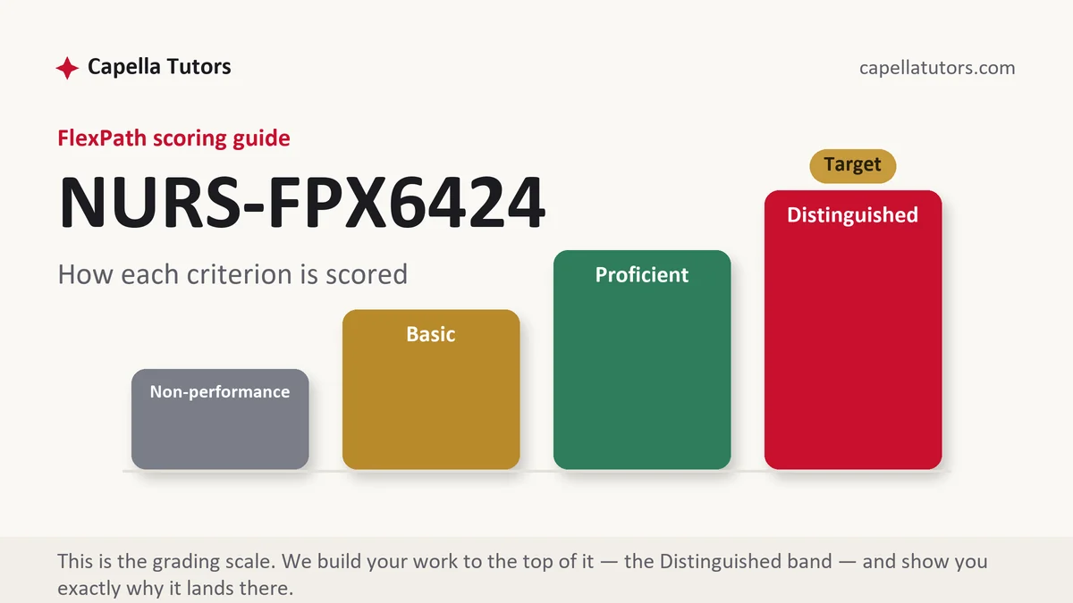
What NURS FPX 6424 actually grades
The criteria sit on four legs. Know where the data lives and whether it is good enough to use. Choose an analytic approach that fits the question you asked. Present the result so the audience can act on it. Interpret it without claiming more than the numbers can carry.
The fourth leg is where grades are decided. A student who writes that a protocol reduced infections, when all they have is two quarters of counts and no comparison group, has lost the analysis criterion in one verb. That sentence is the most common Basic trigger in the course. Distinguished work states the association, offers the rival explanation, and says what evidence would settle the question. Restraint reads as expertise here, and overstatement reads as inexperience.
How we help in this course
Send the scoring guide and whatever data you have access to, even if it is one internal quality report. Our writers on this course build the argument the way an analyst would: question first, data described honestly, method chosen to fit, conclusion sized to the evidence.
The pipeline behind that is standard for us. A research analyst maps the criteria before drafting, a subject-matched writer produces the work, then a scoring-guide pass and an APA and originality pass follow. Delivery is 24 to 48 hours, revisions are free until the work reaches target, and nothing containing patient identifiers ever goes into a draft.
Data quality checks before any conclusion
Every credible analysis in this course opens with an audit of its own inputs. Six checks cover most of it. Completeness asks how much is missing and whether the missingness has a pattern, since a field blank mostly on night shift is telling you about staffing, not about patients. Accuracy asks whether the field means what its label claims, which is where documentation by exception quietly destroys denominators. Timeliness separates when the event happened from when someone charted it. Granularity asks whether monthly totals can answer a question about shifts, because they cannot. Provenance asks which system produced the value and whether its definition changed inside your window. Consistency catches mismatched units, duplicate patient records, and code sets that were remapped last year.
Define the denominator before you touch the numerator. Catheter-associated infections mean nothing without catheter days, falls mean nothing without patient days, and readmissions mean nothing without an index population and a stated window. Then hold one suspicion permanently: a rate that jumps immediately after a documentation change, a new screening prompt, or a coding update is a measurement event until you prove otherwise. The most persuasive move here is to disqualify one of your own variables in writing; a field reported as too incomplete to use shows more competence than data that was conveniently perfect.
Reading a pattern honestly
Confounding is the first thing to name. If the unit that adopted a new mobility protocol is also the unit that gained two nursing assistants that quarter, the protocol and the staffing are tangled and no amount of charting untangles them. Electronic record data adds its own bias, because sicker patients are measured more often, so a variable can look dangerous simply because it is recorded on the people already in trouble.
Small numbers deserve open suspicion. Three events falling to two is a thirty-three percent reduction in a headline and noise in reality, and a percentage built on a denominator of eleven should not be printed as a percentage at all. Comparisons need rates, not counts: raw falls dropping while census dropped further is a worsening rate wearing a friendly number. Aggregation can invert a finding outright, and readmissions that improve overall while worsening inside every risk group is the classic case, which is why stratifying before concluding is not optional. A single bad quarter followed by a better one is usually regression toward the mean, and a run chart with a dozen points tells you whether you are looking at a real signal or the ordinary bounce a process always had.
Language carries all of this. Associated with, occurred alongside, preceded, consistent with: these are claims your data can support. Caused, drove, reduced, improved: these require a comparison group and risk adjustment you almost certainly do not have. Write the honest verb, then add the sentence that lifts the section into Distinguished territory, naming the design that would answer the causal question, whether that is a concurrent control unit, a staged rollout, or a risk-adjusted model.
The assessments, one by one
Assessment 1
Send us the scoring guide and this deliverable comes back as a premium original sample inside 24 to 48 hours, revised free until it satisfies the guide. Read the full Assessment 1 manual.
Assessment 2
Hand this one off and a premium original sample arrives inside 24 to 48 hours, revised free until it meets your guide. Read the full Assessment 2 manual.
Assessment 3
Our team can return this as a premium original sample with a walkthrough attached, inside 24 to 48 hours. Read the full Assessment 3 manual.
Assessment 4
A premium original sample for this deliverable arrives inside 24 to 48 hours and stays in revision until your guide is met. Read the full Assessment 4 manual.
How to actually write NURS FPX 6424: where to begin
Turn the scoring guide into your outline before you look at a spreadsheet, then convert the assignment into a question a dataset could actually answer. Population, measure, comparison, and time window all have to be in it. Did the infection rate per 1,000 catheter days on one medical unit change across the two quarters after a nurse-driven removal protocol, measured against a similar unit that kept the old process, is answerable. Whether data can improve patient care is not a question, it is a topic, and topics produce Basic papers.
Source the data cleanly and describe what you got. De-identified or aggregate internal extracts work, and so do public sources: CMS Hospital Compare, HCUP, published federal surveillance summaries, AHRQ data resources. Protected health information never belongs in a coursework document, and screenshots of a live chart are a privacy incident, not an appendix. Report the rows, the time span, the fields, and the gaps you know about, so a reader can judge your conclusion against your material.
Then choose the method that fits, not the method that sounds advanced. Descriptive rates and trends answer most nursing questions. A cohort comparison answers a before-and-after question if you have a comparison group. Clustering finds groups you did not define in advance, and a predictive model belongs in your paper only if you can discuss validation and what a false positive costs the nurse who has to respond to it. Sophistication is not credit. A correctly built rate outscores a misapplied model every time.
| Section | What goes in it | What Distinguished looks like |
|---|---|---|
| Question and purpose | The decision the analysis serves, and who will make it. | A question with population, measure, comparison, and window all stated. |
| Data source and description | Where the data came from, its span, fields, and how it was de-identified. | The reader could judge the conclusion from the description alone. |
| Data quality assessment | Completeness, accuracy, timeliness, granularity, provenance, consistency. | At least one variable dropped or qualified, with the reason given. |
| Method and analysis | The approach, why it fits the question, and how the measure was built. | The denominator is defined explicitly and defended against alternatives. |
| Findings and presentation | The result, plus the visual or dashboard view built for a named audience. | Every display shows numerator, denominator, time window, and a comparison. |
| Interpretation and recommendation | What it means, what it cannot mean, and what should happen next. | A rival explanation is stated and the test that would rule it out is named. |
Developing the analysis
Design the display for a specific reader. A unit practice council wants one measure over time with the target line drawn on it. A quality steering group wants the exception and the drill-down behind it. A board wants three numbers and the direction of travel. Whatever the audience, no tile ships without its numerator, its denominator, its time window, and something to compare against, because a number alone cannot be interpreted by anyone. Prefer a run chart to a colored status light, since a green square hides the variation that would have told the reader whether the process is stable. Then write the interpretation in the order that scores: the finding, the rival explanation, the way to distinguish them, the recommendation sized to what you actually know. If the honest recommendation is to fix a data definition before changing any care process, say that.
Citations that survive faculty review
Split the reference list by the work each source does. Peer-reviewed studies from the Capella library, CINAHL, and PubMed support the clinical claims and the measure definitions, held to roughly five years unless you are citing a landmark method. Methodological and professional material comes from AMIA publications on informatics methods, HIMSS work on analytics capability, and the American Nurses Association's informatics scope and standards for the nurse's accountability for data quality. Standards and access questions point to healthit.gov material from the Office of the National Coordinator. Datasets get cited as datasets in APA 7, with the publisher and retrieval details. One discipline separates this course from every other: any statement about what a number means has to be attributable, either to a source or to the analysis you just showed.
The mistakes that land Basic instead of Distinguished
- Causal verbs on correlational data. Reduced, caused, and drove, written from two quarters of counts with no comparison group.
- Counts without denominators. Raw event totals compared across periods whose populations were never the same size.
- Skipping the quality section. Conclusions built on fields whose completeness and definitions were never examined.
- Method theater. A predictive model invoked by name with no discussion of validation or of what a false alarm costs.
- Dashboards without context. Colored tiles carrying no time window, no denominator, and no comparison to anything.
- A conclusion larger than the dataset. A system-wide recommendation drawn from one unit and one quarter.
NURS FPX 6424 questions students actually ask
Do I need real patient data?
No, and protected health information should never enter a coursework file. Work from de-identified or aggregate extracts your organization already publishes internally, or from public sources such as CMS Hospital Compare, HCUP, publicly reported CDC surveillance summaries, and AHRQ data resources. Whatever you use, describe it: rows, time span, fields, and known gaps. A well-described public dataset supports a stronger analysis than a vaguely described internal one.
How do I write about a pattern without claiming it caused anything?
Fix the verb first. Rates were lower alongside the protocol, the decline preceded the education rollout, the two measures moved together: all of those are defensible. Caused, drove, and reduced are not, unless you had a control group and risk adjustment. Then do the part that earns the grade. Name two rival explanations, a real change in care and an artifact such as a documentation update or shifting case mix, and state what evidence would separate them.
How much statistics do I actually need?
Less than students fear and used more carefully than they expect. Rates with correct denominators, percentages that state what they are a percentage of, a median when the distribution is skewed, and a run chart with enough points to show variation will carry most assessments. What the criteria reward is judgment about numbers rather than technique: three events falling to two is noise, a percentage on a denominator of eleven should not be printed, and a jump right after a definition change is a measurement event until proven otherwise.
In NURS FPX 6424 right now?
Send the deliverable, the scoring guide, and the dataset or report you have. The first sample is on us, delivered in 24 to 48 hours.