This manual is for NURS FPX 6424 Assessment 3, start to submission. Our team can return this as a premium original sample with a walkthrough attached, inside 24 to 48 hours. Assessment 3 of NURS FPX 6424 takes your analysis to the people who fund things. Your scoring guide decides the artifacts, and the assessment usually asks for a proposal built on your own data with a worked spreadsheet behind it and a narrated presentation in front of it, so the same finding has to survive three formats: a table an analyst could audit, a visual a committee can read in ten seconds, and a spoken argument that lands in five minutes. Capella's catalog lists the course as NURS-FPX6424, and some courserooms print NURS6424; both point to this same Assessment 3. In current courserooms this assessment typically appears as "Proposal to Administration".
One honesty note before the manual: Capella revises courses and scoring guides over time, so always write to the exact scoring guide attached to your assessment in the courseroom. The course identity above is verified on capella.edu; the method and structure below are our tutors' approach to it, not Capella's official rubric text.
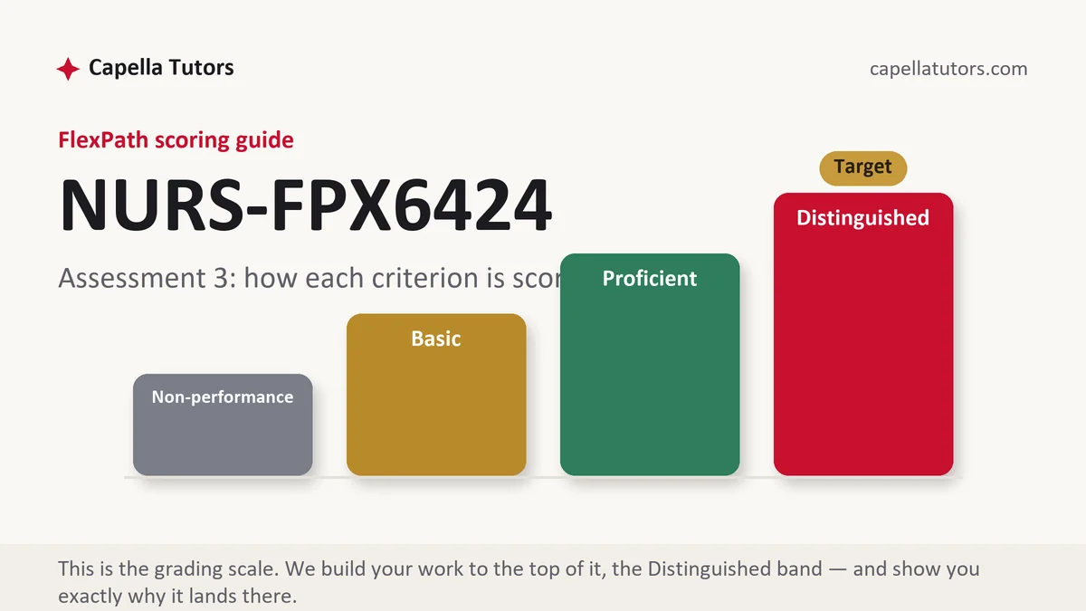
How NURS FPX 6424 Assessment 3 is scored
Four levels per criterion. Across a multi-format deliverable the levels sort by whether the three artifacts tell the same story:
| Level | What it means on a proposal with a spreadsheet and a narrated presentation |
|---|---|
| Distinguished | The spreadsheet is auditable to its source, each visual answers exactly one question with its denominator on the face of it, and the narration adds the reasoning the slides deliberately left out. |
| Proficient | Accurate numbers, clean slides, and a complete narration. Professional, and one move short, because the visuals decorate the argument rather than carry it. |
| Basic | Slides that restate the paper and a spreadsheet nobody could follow. Common, and it caps the criterion regardless of design quality. |
| Non-performance | A required artifact or element is missing, most often the speaker notes or the recommendation itself. |
Multi-format deliverables are scored on coherence more than on polish. A reviewer opens the spreadsheet, checks one number against a slide, and listens to how you describe it. If those three agree, every remaining criterion gets read generously. If they disagree, nothing else in the submission recovers the impression.
The NURS FPX 6424 Assessment 3 method, step by step
-
Build the spreadsheet so a stranger could audit it
One tab for the raw extract untouched, one for the cleaning steps with the count removed at each step, one for the calculation, and one for the figures that appear in the presentation. Label every column with its units and its denominator, keep formulas visible rather than pasting values, and note the source and pull date on the first tab. An auditable workbook earns credit no prose can.
-
Give every visual one question to answer
Decide the single question a chart exists to answer and delete everything on it that does not serve that question. Two questions on one chart produce a slide that gets explained rather than read, and the explanation is the part your audience will not remember. Put the denominator in the title or the axis label so the number never travels without it.
-
Choose the chart form honestly
Time on the horizontal axis for trends, ranked bars for comparisons between categories, and a table when the reader needs exact values. Start bar axes at zero. Avoid dual axes, which imply a relationship the data may not hold. If a percentage is built on a small denominator, show the count beside it, because 67 percent of three is a sentence and not a finding.
-
Write the narration to add, not to read
The slide carries the number; the narration carries the reasoning, the caveat, and the ask. Speaker notes that repeat the slide text waste the only channel you have for judgment. Say what you checked, what surprised you, what you decided not to claim, and what you want approved, in that order.
-
Put the ask and the money on one slide
Name the resource you need, what it buys, who owns the work, and the date it starts. Then show the cost against the measure it is meant to move. A proposal that describes an opportunity without pricing it is read as information rather than as a request, and information does not get funded.
-
Close on a monitoring plan someone else could run
Specify the metric, its denominator, the refresh interval, the owner who reports it, and the threshold that triggers a review. Say how a real change would be distinguished from a documentation change. Support the design choices with published work on dashboard and visualization practice from the informatics literature, HIMSS material, and ONC resources on healthit.gov, cited in current APA.
A structure that maps to the criteria
The targets below are the proportions our tutors plan to across the written portion of this deliverable, not Capella rules; your scoring guide governs slide counts and file formats.
| Section | What it must do | Guide |
|---|---|---|
| The ask, first | The recommendation, the resource, the owner, and the date, stated before any evidence. | ~150 words |
| The finding and its denominator | The rate that justifies the proposal, with numerator, denominator, window, and comparison. | ~250 words |
| The workbook explained | What each tab holds, which cleaning steps removed how many rows, and how a reviewer would verify one figure. | ~250 words |
| Visual design decisions | The question each chart answers, the form chosen, and what was deliberately left off. | ~250 words |
| Narration plan | Slide by slide, what the voice adds beyond the text: reasoning, caveat, and ask. | ~250 words |
| Monitoring, limits, references | Metric, refresh interval, owner, review threshold, one stated limit, and current APA sources. | ~250 words |
Annotated sample excerpt
An original model excerpt from our team, showing how a slide and its narration divide the work. Take the pattern and build your own around your own data.
Slide 4 carries one chart and one sentence: follow-up calls completed within 7 days of discharge, as a share of eligible heart failure discharges, by month, with the eligible count printed under each bar.1 The narration supplies what the chart cannot: completion sat between 58 and 63 percent for nine months, rose to 81 percent in April, and the rise coincides with a change in how the call is documented rather than with any change in staffing, so the honest reading is that April measured the same work more completely.2 The ask follows immediately: 0.5 of a full-time equivalent for twelve months, owned by the cardiology service line director, evaluated on completion within 7 days against a monthly denominator, with a review at three months and a stated threshold, since a program that cannot move the measure by ten points in a quarter should be redesigned rather than extended.3
- 1One chart, one question, and the denominator printed on the face of the graphic. A committee member who looks away after five seconds has still read it correctly.
- 2Uses the spoken channel for the judgment the slide cannot hold, and separates a real improvement from a documentation change without being asked. This is the single most valuable sentence in the deliverable.
- 3Prices the request, names the owner, ties it to the measure, and sets the condition under which it should be stopped. Proposals with a stopping rule are the ones committees trust.
The full premium sample for your exact assessment, written fresh to your scoring guide and issue, is free to request. Study it, revise it into your own voice, and submit work you understand.
The five mistakes that cost Distinguished
- A workbook nobody can audit. Pasted values, unlabeled columns, and no record of what cleaning removed leaves the numbers unverifiable, and a reviewer who cannot verify one figure stops trusting all of them.
- Two questions on one chart. A dual-axis graphic implies a relationship the data may not support and guarantees the slide has to be explained rather than read.
- Speaker notes that read the slide. Repeating visible text spends the only channel available for reasoning, and the narration criterion is measuring reasoning.
- A percentage on a tiny denominator. Sixty-seven percent of three patients is arithmetic, not evidence, and printing the count beside it is the fix that costs nothing.
- A proposal with no price. An opportunity described without a resource, an owner, and a date is information, and information is not something a committee can approve.
Pre-submission checklist
- The recommendation, resource, owner, and start date appear before the evidence
- Workbook auditable: raw tab, cleaning counts, visible formulas, source and pull date
- Every chart answers one question, with its denominator on the graphic
- Bar axes start at zero, and no dual-axis chart implies an untested relationship
- Speaker notes add reasoning, caveats, and the ask rather than repeating slide text
- Monitoring metric, refresh interval, reporting owner, and review threshold specified
Want the proposal and the deck built?
Send the scoring guide, your data or its description, and the audience you are presenting to. We return the written proposal, an auditable workbook structure, and speaker notes written to be spoken, inside 24 to 48 hours, with two quality passes and free revisions until it meets the guide.