Give us the prompt, the criteria, and whatever article, advertisement, or bill the assessment is built around, and premium original work returns in 24 to 48 hours, aimed at the Distinguished descriptors in your guide, with a second reader tracing every figure back to the source it came from. The course is MAT FPX 2150, Data and Statistics for Everyday Life, 3 points, taught in FlexPath. It sits inside Capella's general education requirement, and some bachelor's programs name it directly rather than leaving the pick open, so check your own program's requirement list before assuming either way. The requirement as a whole asks for at least 22.5 points, with no fewer than 2 points from each of Communication, Humanities, Natural Science and Mathematics, and Social Science. In Capella's catalog the course code is written MAT-FPX2150.
What MAT FPX 2150 actually grades
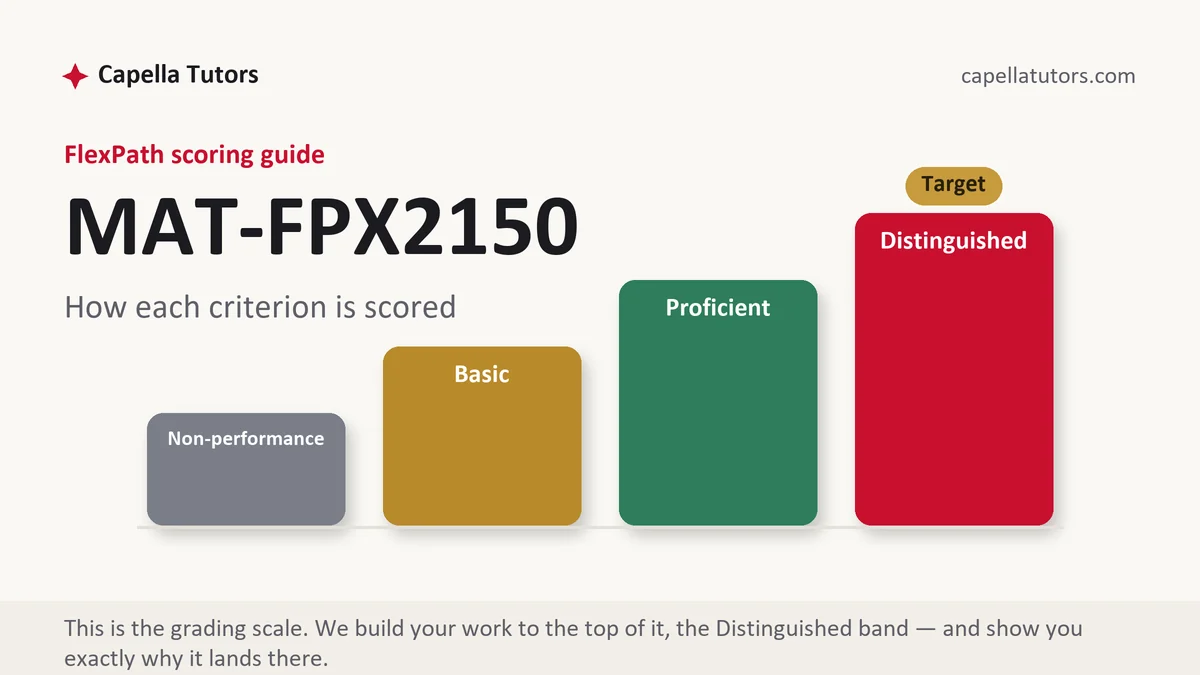
This course grades you as a reader of numbers rather than as a producer of them. The assessments here usually set a real claim in front of you, a headline, a package label, a benefits comparison, a rate quoted in a mailer, and ask whether it survives inspection and how you would state it honestly to somebody who is not going to check. A Basic answer calls the claim misleading and leaves the accusation there. The column above it shows the arithmetic that exposes the trick, supplies the quantity the claim left out, and then writes the corrected sentence out in full.
Most of the marks turn on a small set of moves, and the first is the gap between relative and absolute. A treatment that cuts a risk from 2 cases in 10,000 to 1 case in 10,000 has halved the risk, which is entirely true and sounds enormous, while the absolute change is one case in ten thousand people and around ten thousand would need the treatment for one of them to benefit. Both descriptions come from the same two numbers. Only one of them lets a reader decide anything. The same trap sits in the difference between a percent and a percentage point, since approval climbing from 40 percent to 44 percent is a rise of four percentage points and also a rise of ten percent, and a headline is free to choose whichever sounds better.
The second cluster is ordinary arithmetic that goes wrong quietly. Averages cannot be averaged unless the groups behind them are the same size, so a section of 20 students averaging 88 and a section of 5 averaging 60 do not combine to 74. Weight them properly, 20 times 88 plus 5 times 60, divided by 25, and the real figure is 82.4. Money from different years cannot be compared until it is adjusted, so a wage that moved from 12.00 dollars an hour in 2005 to 17.50 in 2025 has risen by about 46 percent in name and by considerably less, if at all, once prices are taken into account. Per capita figures, unit prices, and interest quoted monthly against yearly all belong to the same family, and criteria in this course read them closely.
How we help in this course
Our 2150 work starts by finding the number under the claim. Every figure in the sample is traced to the table or report that published it, given its denominator and the period it covers, and then rewritten into a sentence the source can actually support. Where the assessment names an audience, the language is set for that audience and stays there, and where a comparison needs a base year or an inflation adjustment, the adjustment appears in the text rather than being waved at. Send the advertisement, screenshot, or article you were assigned and the analysis is built on that item rather than on a substitute we found convenient.
Terms do not change from course to course here. You get the work within 24 to 48 hours, written toward the Distinguished column, with eight sets of hands on it before delivery. Someone maps the criteria, someone hunts down the underlying data, a writer builds the analysis, a second reviewer re-derives every percentage and adjustment from the raw figures, a scoring-guide reviewer grades the draft against your rubric row by row, a citation pass checks each source in both directions, and an editor reads the plain-English version as a reader with no statistics background would. Revisions are free until the guide is met, and returned faculty comments cost nothing to address.
The assessments, one by one
Assessment 1
The opening deliverable in this course usually sets a real claim in front of you and asks whether it survives inspection. Read the full Assessment 1 manual.
Assessment 2
The middle deliverable in this course usually turns on a piece of arithmetic that goes wrong quietly. Read the full Assessment 2 manual.
Assessment 3
The third deliverable in this course usually asks you to compare two moments and report the comparison honestly. Read the full Assessment 3 manual.
How to actually write MAT FPX 2150: where to begin
Read the criteria first and pay attention to who you are told to write for. Prompts in this course routinely name an audience, a friend making a purchase, a supervisor, a community group, a patient, and the criterion about communication is scored against that person rather than against your instructor. Set the audience down at the top of your working document and let it decide every word choice underneath. Then split the assessment the way the guide splits it, usually one part that examines the claim and one part that communicates a corrected version, and give each part its own space instead of letting the analysis swallow the rewrite.
Now interrogate the claim in a fixed order, because the order is what stops you missing something. Take a company reporting that 78 percent of its customers prefer its service. Ask who was counted, how many were approached, how the respondents were chosen, when the question was asked, and what the alternatives on offer were. Suppose the survey went to 5,300 customers by email and 214 replied, a response rate near 4 percent, which makes the celebrated 78 percent about 167 people out of 5,300 who could have answered. The honest sentence writes itself: of the 214 customers who responded to a March email survey, 167 said they preferred this service, and the roughly 5,100 who did not reply are unaccounted for. Nothing in that rewrite is hostile, and every part of it is scoreable.
Finish by matching your precision to your evidence and your units to your reader. A survey of 214 people does not support an answer given to one decimal place, and a monthly saving is more useful expressed as a figure per month than as an annual percentage nobody can picture. Carry units through every calculation so a reader can follow the conversion, state the base year whenever you adjust for prices, and keep the same figure identical in the narrative, the table, and any chart, because a reader who spots two versions of one number stops trusting the rest.
| Section | What goes in it | What Distinguished looks like |
|---|---|---|
| The claim | The sentence under examination, quoted exactly, with where and when it appeared. | The wording quoted rather than paraphrased into something easier to knock down. |
| The numbers behind it | The figure, its denominator, the period it covers, and who published it. | Each number traced to an original table, not to the article repeating the table. |
| The check | The arithmetic that tests it: a rate, a percent change, a weighted average, an adjustment. | The calculation shown in the text, with units carried through every step. |
| What is missing | The comparison group, the baseline, or the absolute size the claim leaves out. | The missing quantity supplied as a figure, not merely reported as absent. |
| The honest version | The claim rewritten so its source supports it, pitched at the audience named in the prompt. | One sentence that reader could act on, using no term they would have to look up. |
| Sources | The data table, the item you examined, and any calculator used, in current APA. | Original series named and dated, with the advertisement or article cited as itself. |
Developing the analysis
The useful distinction in this course is between a claim that is false and a claim that is true and still leaves a reader worse informed. Almost everything you will be handed belongs to the second group, which is why calling it a lie both overstates the case and misses the criterion. Work out instead which single choice created the impression: a starting year selected because it was unusually low, a flattering subgroup reported as though it were everyone, a percentage substituting for a count, or a comparison group quietly withheld. There is a fair side to this too, and saying so shows judgment. A relative figure is the right one when two options are being compared head to head, per capita is the right one when populations differ, and a median is the right one when a few extreme values would otherwise dominate. The test is never which form sounds modest. It is whether the reader can make a decision after reading it. Self-selection deserves the same even treatment, because the people who post reviews or answer polls chose to, and that choice is usually related to the thing being measured.
Citations that survive faculty review
Cite the table, not the coverage of the table. Consumer price figures and wage series come from the Bureau of Labor Statistics, which also publishes the inflation calculator most students use for adjustments, population and household characteristics come from the Census Bureau, and health claims should be checked against the Centers for Disease Control and Prevention or the National Center for Health Statistics rather than against the article summarizing them. For survey claims, go to the methods panel that reputable pollsters publish, Pew Research Center being the usual example, and read the sample size, the field dates, the mode of contact, and the margin of error before you quote the topline. When the item you are analyzing is an advertisement, a mailer, or a package label, cite that item as itself with the date and where you encountered it, and keep the screenshot. Put the reference list in current APA, name each series or table precisely enough that a reader could pull it up, and record the date you retrieved anything that gets revised.
The mistakes that land Basic instead of Distinguished
- A relative change with no absolute figure beside it. Halved and reduced by one case in ten thousand describe the same event to two different readers.
- Percent and percentage point used as synonyms. They differ by whatever the starting value happens to be, which is the whole trick.
- Two averages averaged together. Without weighting by group size the result describes nobody in either group.
- Dollars from different years set side by side. An unadjusted comparison measures inflation and calls it growth.
- A rewrite aimed at no one in particular. The audience the prompt named is the audience the communication criterion is scored against.
MAT FPX 2150 questions students actually ask
The prompt says explain it to a non-technical audience. How plain is plain?
Plain enough that a reader could repeat your sentence to somebody else and get it right. In practice that means quantities in units people already live in, dollars a month rather than basis points, one extra case in a thousand rather than a hazard ratio, and no term the audience would have to look up. Two tests catch most of it. Read the sentence aloud, and if you run out of breath before the verb, split it. Then ask what the reader is supposed to do differently after reading it, and if there is no answer, the sentence is decoration. Writing plainly is not writing loosely, so keep the denominator and the period in place while you simplify, because those are the parts a general audience most needs and most often does not get.
Do I have to find my own real-world example, and where do I look?
Where the prompt lets you choose, pick something you can trace to a published number, because an example you cannot verify will stall the whole assessment. Product advertising, a mailed insurance or loan offer, a job posting quoting a salary, a utility bill comparison, a school or city performance report, and any health claim on a package all work well, since each rests on a figure somebody published. Screenshot or scan it with the date and where you found it, then go looking for the underlying source before you commit to it. If forty minutes of searching produces no table behind the claim, that absence is itself worth writing about, and it is usually a better assessment than a claim that checks out cleanly.
Is it enough to say the statistic is misleading?
No, and that sentence on its own is close to a definition of the Basic column. Most claims you will be handed are literally true, which is what makes them worth studying, so the graded work is identifying the specific choice that produced the impression: a base year picked because it was unusual, a subgroup reported instead of the whole, a percentage standing in for a count, or a comparison group quietly left out. Name the choice, show the arithmetic that exposes it, and supply the figure the claim omitted. Then write the honest version of the sentence. An evaluator can score all four of those. An adjective they cannot score at all.
A claim to pull apart this week?
Send the criteria and the item you were told to analyze. It comes back with the source found, the arithmetic shown, and the honest sentence written for the audience your prompt named. First premium sample free.