Send the prompt, the scoring guide, and whatever data file you were given, and a premium original sample returns inside 24 to 48 hours, written to the Distinguished wording in your own guide with every figure recomputed by a second reader first. The registrar lists this one as MAT FPX 2001, Statistical Reasoning, worth 3 points, sitting in the Natural Science and Mathematics category of Capella's general education menu and delivered in FlexPath. That menu is chosen rather than assigned: at least 22.5 points overall, with a minimum of 2 points from each of Communication, Humanities, Natural Science and Mathematics, and Social Science. This course is one route through the mathematics side, not a box every undergraduate has to tick. In Capella's catalog the course code is written MAT-FPX2001.
What MAT FPX 2001 actually grades
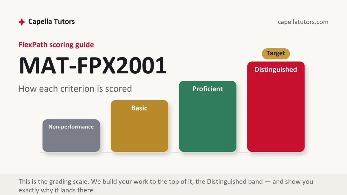
Statistical Reasoning grades what you say about a number, not how quickly you can produce one. A spreadsheet hands you the mean in a second, and no criterion on your guide pays for that second. In current courserooms the assessments follow a survey project from design to results: an initial survey design, a focused survey template, descriptive statistics, then evaluating published studies and interpreting survey results, each asking what a reader is entitled to conclude. A Basic response quotes the average and stops. The column above it puts center and spread in one sentence, names the shape of the distribution, and says why that pairing was the honest one.
Look at what an average conceals when it travels alone. Two twelve-person study groups sit the same quiz and both average 78. In the first, every score falls between 74 and 82, the standard deviation is near 2.6, and the average describes everyone in the room. In the second, four students scored in the 50s, three cleared 95, the standard deviation runs close to 17, and the average describes nobody while hiding the four people who need help most. One number, two entirely different rooms. Range, interquartile range, and standard deviation exist for that reason, and a criterion asking you to summarize a data set is asking for both halves of the summary.
The rest of the course lives at the bottom of the fraction. Rates are graded on their denominators and their windows, so 240 reported incidents means nothing until it becomes 240 incidents among 4,800 enrolled students across one academic year, which is 5 percent, and which is a different quantity again from 240 in a single month. The same discipline applies upstream, where the data were collected: who was asked, how many answered, and whether the people who answered differ from the people who ignored the request. A poll on a website that anyone can click is not a sample of any population, and saying so plainly earns marks. Where two variables move together, the criteria want more than the slogan about correlation and causation. They want the third thing that could be driving both, named.
How we help in this course
Our 2001 samples show the arithmetic and then translate it. Every mean arrives with a measure of spread and the count of observations behind it, every percentage arrives with its denominator and the period it covers, and every table is described in a sentence that could be read aloud to somebody who has never seen the data. Send the file your prompt supplied, or the output you generated in Excel or StatCrunch, and the sample is built on your figures rather than invented ones, so your evaluator can check them against the source.
Terms are the studio's standard ones. Work lands inside 24 to 48 hours aimed at the Distinguished column, and eight people handle it before you see it: a research analyst reads your scoring guide, a writer with a quantitative background drafts, a second mathematician recalculates every value independently and has to reach the same answer, a scoring-guide reviewer marks the draft row by row the way a Capella evaluator will, an APA pass reconciles citations and table formatting both ways, and an editor reads last for plain sense. Revision is free until the work clears the guide, and faculty comments re-enter the same cycle at no charge.
The assessments, one by one
Assessment 1: Initial Survey Design Template
Choose a survey topic, explain its significance, identify the population and sample, draft questions and plan how the data would be collected. Read the full Assessment 1 manual.
Assessment 2: Design a Focused Survey Template
Refine your survey into focused, well-worded questions with appropriate answer scales, define variable types, and plan how each question will be analyzed. Read the full Assessment 2 manual.
Assessment 3: Analyzing Data with Descriptive Statistics
Summarize a data set with measures of center and spread, build appropriate graphs, and interpret what the statistics show for the question being studied. Read the full Assessment 3 manual.
How to actually write MAT FPX 2001: where to begin
Let the scoring guide dictate the shape of the document before you open the data. Copy each criterion into an empty file as a heading, paste the Distinguished sentence beneath it, and write nothing that does not belong under one of those headings. Statistics criteria are nearly always built from two verbs, one asking you to calculate and one asking you to interpret, and the second verb carries the marks. The trick that works is to draft the interpretation sentence first, in ordinary English, then generate the number that earns you the right to say it. Working the other way round produces a page of correct output with no argument attached.
Here is the move the whole course is testing. Suppose a sample of 412 adults reports a mean of 6.4 hours of sleep on a work night, a standard deviation of 1.3 hours, and a 95 percent confidence interval running from 6.27 to 6.53 hours. The Basic write-up repeats those four numbers and stops. The version that scores says the typical adult here slept about six hours and twenty-four minutes, individual nights varied by roughly an hour and twenty minutes either side of that, and if the sampling was sound the true average for the wider population very likely sits between six hours sixteen minutes and six hours thirty-two minutes. Then it adds the line that separates the columns, which is what the interval does not say. It is no promise that 95 percent of adults sleep inside that range, and a wider interval would not mean the study was wrong, only that it carried less information.
Write in the order a reader can follow: the question, where the data came from, what the data look like, what can be inferred past them, and what the analysis cannot settle. Hold full precision inside the calculation and round once at the end, and never round midway and then feed the rounded value into the next step. Attach a unit and a sample size to every statistic, and make sure the figure in the narrative matches the figure in the table, because a total that changes between two pages costs you the reader's trust.
| Section | What goes in it | What Distinguished looks like |
|---|---|---|
| The question | The question phrased so an answer could be right or wrong, and the variable that answers it. | A question narrow enough to test, with the population it refers to named. |
| Where the data came from | Source, collection method, sample size, response rate, and the period covered. | The sampling method identified and its weakness admitted before a reader finds it. |
| Describing the data | Center, spread, shape, and any values sitting far away from the rest. | Center and spread chosen to fit the shape, with the choice defended in one sentence. |
| The visual | A histogram, boxplot, or scatterplot with labeled axes and a numbered caption. | A baseline at zero where one belongs, and the chart described in words rather than left to speak. |
| The inference | The interval, the test, or the comparison, with its assumptions listed. | The result given in plain English and kept separate from what it does not prove. |
| Limits and sources | What these data cannot answer, plus the data set and references in current APA. | Limits tied to the collection method, with the source table cited by number and retrieval date. |
Developing the analysis
Statistics stops being settled where it meets ordinary language, and that tension is worth a paragraph in almost any assessment here. A result called statistically significant only says the pattern would be unlikely to appear this strongly if nothing were going on, and with a large enough sample nearly any difference clears that bar. A gap of 0.3 pounds in average weight across 40,000 people can be significant and useless, while a gap of nine minutes in average response time across 60 emergency calls can matter enormously and miss the threshold. The American Statistical Association issued a statement on p-values in 2016 making the same point, and the safest habit an undergraduate can build is to report the size of the effect beside the test result. Treat the interval that way too, since its width is information: a narrow one says the estimate is pinned down, a wide one says the study was too small to settle anything.
Citations that survive faculty review
Three kinds of source do three different jobs in a statistics assessment. Definitions of method, meaning what a confidence interval is or when a median is preferred, come from your course materials and the documentation of whatever software you ran, cited rather than quoted. Real data come from agencies that publish their methodology beside their numbers, principally the Bureau of Labor Statistics, the Census Bureau, the National Center for Health Statistics, and FRED at the Federal Reserve Bank of St. Louis, and the citation names the table or series, the years covered, and the date you retrieved it, because those series get revised. Published findings come from peer-reviewed articles reached through the Capella library rather than from the news story about them, and the reading order matters: methods, sample size, and how the sample was drawn come before the abstract's conclusion, since that is where the reasons for doubt are kept. Format statistics as current APA asks, then check the reference list against the text both ways.
The mistakes that land Basic instead of Distinguished
- A mean with no spread beside it. An average alone cannot tell a reader whether the group is uniform or split in two.
- A percentage with no denominator. Until the bottom of the fraction and the period are stated, the figure is decoration.
- A p-value read as the chance the claim is false. It describes data under an assumption, not the assumption.
- Software output pasted in raw. A table with no sentence under it hands the interpretation back to the person grading you for it.
- A vertical axis that does not start at zero. Bars exaggerating a small gap read as careless or as dishonest, and both cost the same.
MAT FPX 2001 questions students actually ask
Do I need the formulas, or can I just use the software?
Use the software, and understand what it produced. Nothing here rewards computing a standard deviation by hand, and the criteria are written for somebody who will meet statistics in a workplace with a spreadsheet already open. What the guide checks is whether you picked the right procedure for the data in front of you, whether you know its assumptions, and whether you can say what the output means to a reader who does not know what a quartile is. Name the tool and the settings, keep the output, and where the prompt asks for steps, show the inputs and the intermediate values rather than a derivation. A correct answer from a tool you cannot explain is worth less than the same answer explained.
How do I write about a p-value without saying something wrong?
Anchor the sentence to the data rather than to the truth of the claim. A p-value of 0.03 says that if there were genuinely no difference, results at least this extreme would appear about three times in a hundred studies like this one. It does not say there is a 97 percent chance the difference is real, and it says nothing at all about how large the difference is. Build the sentence in that order: what was compared, how big the gap was in the units of the thing measured, then the p-value last. Where the guide asks for a conclusion, tie it to the significance level you set in advance, and treat a result on the boundary as a reason to collect more data rather than as a decision.
The mean and the median disagree. Which one do I report?
Report both, and let the gap between them do some work. In a symmetric distribution the two sit close together and either will serve. When a handful of very large values drag the mean above the median, as happens with incomes, house prices, hospital stays, and repair bills, the median describes the typical case while the mean describes the total shared out evenly, and those answer different questions. State which one you chose and why, then put the interquartile range beside the median or the standard deviation beside the mean so the spread travels with the center. Explaining what the disagreement reveals about the shape of the data is one of the cheapest ways out of the Basic column.
Statistics assessment due?
Send the prompt, the criteria, and the data file or the output you were handed. Every figure comes back recalculated and every figure comes back explained. The first premium sample you order is free.