This manual is for MAT FPX 2001 Assessment 1, start to submission. The Initial Survey Design Template begins a survey project that runs through the course: you choose a topic, explain why it matters, identify the population you want to learn about and how you would sample it, draft initial questions, and describe how you would collect the data, using the template in the courseroom. The grade turns on design thinking. A clear population, a sensible sampling plan and questions that would produce usable data score above an interesting topic with vague methods. Below is the method our tutors use, a structure that maps to the criteria, and an annotated sample excerpt. Prefer to hand it off? A premium original sample for this exact assessment comes back in 24 to 48 hours, revised free until it meets the guide. Capella's catalog lists the course as MAT-FPX2001, and some courserooms print MAT2001; both point to this same Assessment 1. In current courserooms this assessment typically appears as "Initial Survey Design Template".
One honesty note before the manual: Capella revises courses and scoring guides over time, so always write to the exact scoring guide attached to your assessment in the courseroom. The course identity above is verified on capella.edu; the method and structure below are our tutors' approach to it, not Capella's official rubric text.
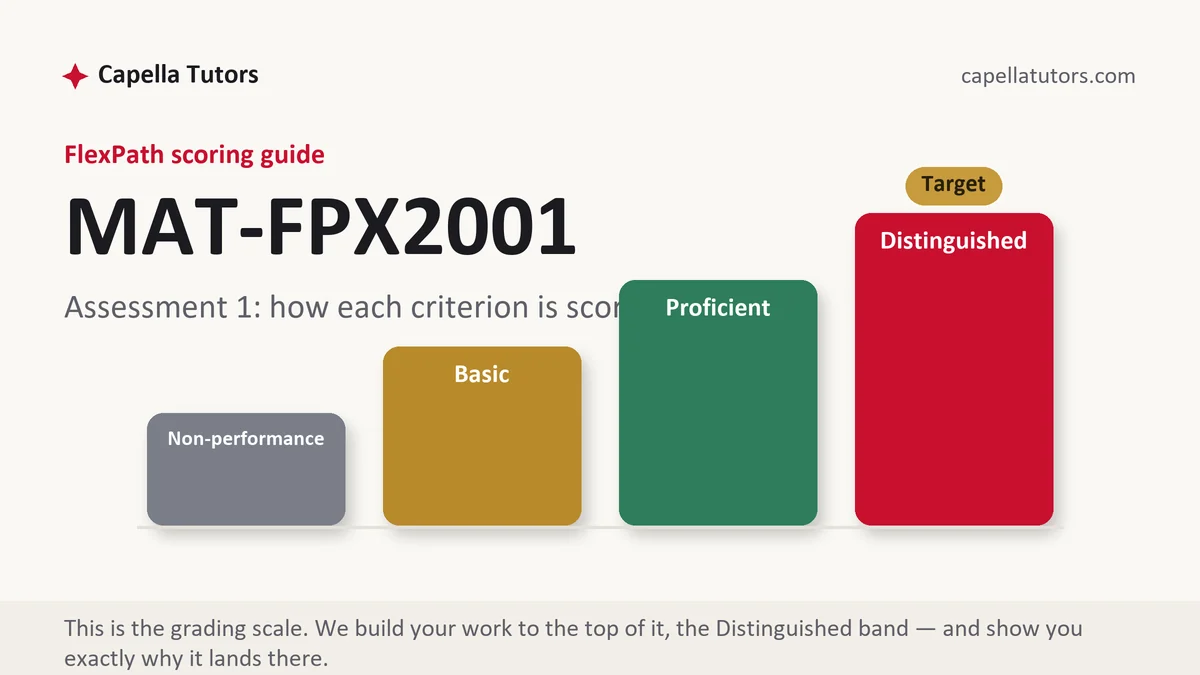
How MAT FPX 2001 Assessment 1 is scored
FlexPath does not use letter grades. Each criterion in the scoring guide lands on one of four levels, and the level descriptions are the real writing brief:
| Level | What it means on the initial survey design |
|---|---|
| Distinguished | The topic is focused and its significance explained, the population and sampling method are defined with possible bias noted, questions are clear and unbiased, and data collection is practical. |
| Proficient | The template is complete, but sampling or questions need refinement. |
| Basic | The topic is broad and the methods are vague. |
| Non-performance | A template section is missing. |
Keep the topic manageable. Later assessments refine this design, analyze data and interpret results.
The MAT FPX 2001 Assessment 1 method, step by step
-
Choose a topic
A question you can survey, such as remote work satisfaction in your department.
-
Explain significance
Why the answers would be useful and to whom.
-
Define the population
Exactly who the survey is about.
-
Plan the sample
Random, stratified or convenience sampling, with the bias each might introduce.
-
Draft questions
Clear, neutral questions with defined answer options.
-
Plan collection
Online survey, timing and how responses will be recorded.
A structure that maps to the criteria
Complete the template in your courseroom; these are the fields evaluators check.
| Section | What it must do | Guide |
|---|---|---|
| Topic of survey | A focused topic. | template field |
| Significance | Why it matters. | template field |
| Population and sample | Who and how. | template field |
| Initial questions | Clear, neutral questions. | template field |
| Data collection | How data will be gathered. | template field |
Annotated sample excerpt
An original model excerpt from our team, written to show the register that reaches the top of the guide. Learn the moves, then write your own version.
Population: all full-time employees at the company's three regional offices, about 450 people.1 Sample: a stratified random sample of 30 employees from each office, drawn from the staff list, so that the larger headquarters office does not dominate the results.2 A convenience sample of whoever answers an all-staff email would be easier, but it would over-represent employees with strong opinions, which is the bias this design is meant to avoid.3
- 1Defines the population exactly.
- 2Chooses a sampling method with a reason.
- 3Names the bias the design avoids.
The full premium sample for your exact assessment, written fresh to your scoring guide and topic, is free to request. Study it, revise it into your own voice, and submit work you understand.
The five mistakes that cost Distinguished
- A broad topic. Narrow it to something you can survey.
- Undefined population. Say exactly who is included.
- Ignoring bias. Explain how sampling could skew results.
- Leading questions. Write neutral wording.
- No collection plan. Describe how data will be gathered.
Pre-submission checklist
- Focused topic
- Significance explained
- Population defined
- Sampling method and bias
- Clear, neutral questions
- Data collection plan
Want the survey design template written?
Send the scoring guide and any materials from your courseroom. Our team returns a premium original survey design template in 24 to 48 hours, revised free until it meets the guide.