Hand us the app brief, the scoring guide, and whatever you have already built, and a premium original sample returns inside 24 to 48 hours with every interface and architecture decision tied to a platform guideline and a user constraint, reviewed by a second reader before delivery. Your transcript will show IT FPX 4780, Mobile Application Design and Development, one of the IT-FPX courses that turns up as an elective on some plans and inside a specialization on others rather than as a universal requirement, delivered in FlexPath within a BS in Information Technology whose two FlexPath specializations are General Information Technology and Information Assurance and Cybersecurity. Check your own program evaluation for the point value and the slot this course fills, because that page is the authority on both. In Capella's catalog the course code is written IT-FPX4780.
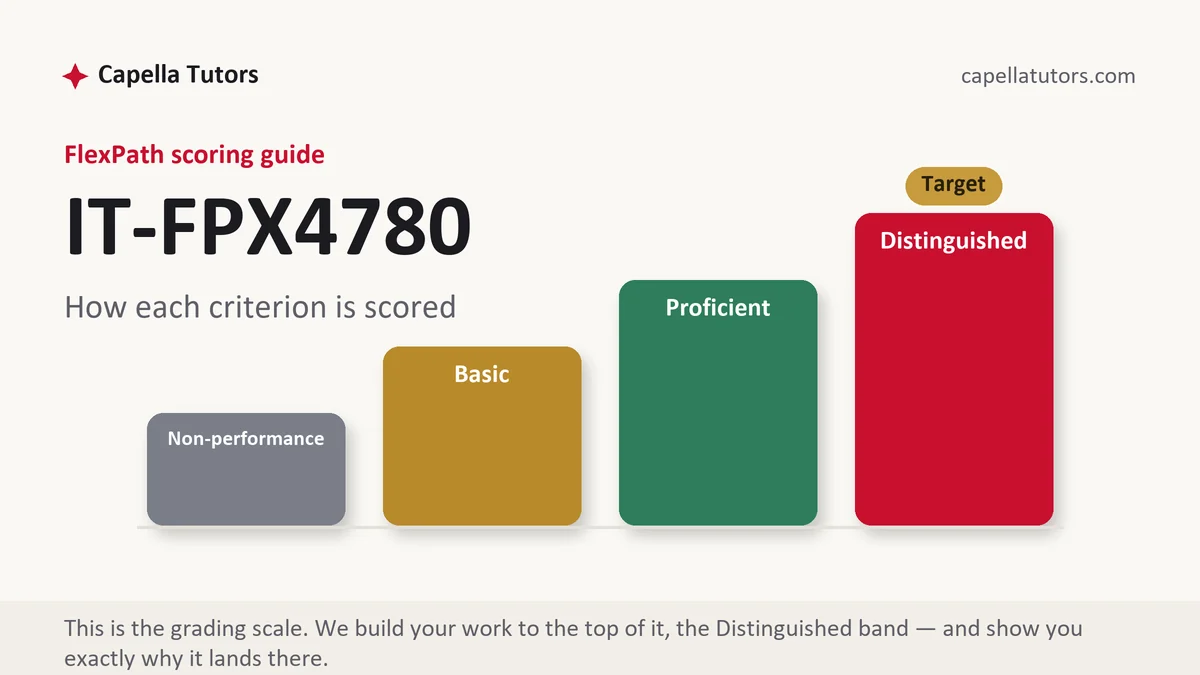
What IT FPX 4780 actually grades
Two artifacts usually travel together in this course, something that runs and a document that explains why it runs the way it does, and the criteria weight the second more heavily than students expect. The design half is graded as a chain rather than as a gallery: who the users are, what single job they came to do, the task flow written as numbered steps, the screen inventory that flow implies, the navigation model chosen from tabs or a stack or a drawer, then wireframes, then a prototype, then the build. Break the chain anywhere and a screen appears that nothing in the analysis asked for, which is the most visible failure a reviewer can point at. Platform convention is the other early trap, because the two dominant systems disagree about basic gestures. One has a hardware-level back behavior that every screen must answer for, the other pushes navigation into the header, and an interface copied straight across without adjustment is broken on one of them before a single line of logic runs.
The engineering middle of the course is state, and it is where most builds quietly break. A screen on the leading mobile platform is destroyed and rebuilt when the device rotates, so anything held only in a variable is gone, and the same applies more brutally when the operating system reclaims a backgrounded process and later restores the user to where they think they were. Three storage tiers answer that: a small bundle of saved instance state for what the screen needs to redraw, an in-memory holder that survives a configuration change but not process death, and a real local database for anything the user would be angry to lose. Connectivity is the second half of the same problem. An application written on the assumption that the network is present is the most common design defect at this level, and offline-first is the correction: read from local storage, write locally first, queue the outbound change, and define what happens when the server and the device disagree, whether that is last write wins, a merge on a field, or a prompt. Background execution is metered by the platform, so scheduled work runs when the system allows rather than when you asked, and long operations never run on the thread that draws the interface, because a frozen screen is judged as a defect and not as slowness.
The third strand is trust and reach. Permissions are requested at the moment of need with a short explanation, not in a burst at first launch, and the request is for the least that will do, which means coarse location when coarse location answers the question. Credentials and tokens belong in the platform keystore rather than in ordinary preference storage, network traffic is protected by default, and nothing secret is compiled into a package that anybody can unpack. Accessibility is a scored criterion rather than a courtesy: every control including icon-only buttons carries a label a screen reader can announce, contrast is measured rather than eyeballed, layouts survive a user who has doubled the system text size, touch targets meet the platform minimum, and focus moves in an order that matches the visual one. Distribution closes the set, since store review policy, privacy disclosure, and version handling are part of shipping and belong in the document even when the assignment stops at a test build.
How we help in this course
Mobile work from us arrives with the reasoning attached. Personas and task flows come out of the brief rather than out of a template, the screen inventory is traceable to a step in a flow, every layout decision names the guideline it follows and the constraint it serves, state handling is specified for rotation and for process death, the data layer states its offline behavior and its conflict rule, and permissions are listed with the moment they are requested and the sentence shown to the user. Where the deliverable includes code, it comes commented at the places a criterion will look. Tell us the platform, the toolkit, and the device sizes you can actually test on, and the document will describe a build you can defend.
Delivery does not change between courses. You get the work inside 24 to 48 hours, aimed at the Distinguished column, after an eight-person pipeline has run it: research retrieves your guide and the current platform documentation, a subject writer builds the design rationale and the architecture, a scoring-guide reviewer grades the draft against each criterion, an APA and originality pass reconciles the references, and an editor reads it last. Free revisions continue until the guide is met and faculty feedback re-enters the queue at no charge. Since an attempt can take two business days to come back evaluated, and since a mobile build tends to reveal its problems late, the schedule that works is the one that puts a complete draft in front of a reviewer early.
The assessments, one by one
Assessment 1
The opening deliverable in IT FPX 4780, Mobile Application Design and Development, normally asks you to define who the app is for, name the one job it exists to do, write that job out as numbered steps, and turn the steps into a screen inventory and a navigation model you can defend. Read the full Assessment 1 manual.
Assessment 2
The middle deliverable in IT FPX 4780, Mobile Application Design and Development, usually moves under the interface: separate logic from screens, decide what survives a rotation and what survives the operating system reclaiming your process, specify local storage, and define what happens when the. Read the full Assessment 2 manual.
Assessment 3
The closing deliverable in IT FPX 4780, Mobile Application Design and Development, is usually where the build has to prove itself: screen-reader labels on every control, contrast measured rather than eyeballed, layouts that survive doubled system text, permissions requested at the moment of need,. Read the full Assessment 3 manual.
How to actually write IT FPX 4780: where to begin
Read the scoring guide, then cut the app down to one job. The most reliable way to lose marks here is breadth: five half-finished screens read worse than one task carried end to end with its empty state, its error state, its loading state, and its confirmation. Write the primary task as numbered steps, count the taps, and then justify the count, because an interface that needs seven taps to do the thing the app exists for has a design problem that no color palette repairs. From that flow, list the screens, then list what each screen needs to know when it is rebuilt from nothing, which is the question that later saves your state handling.
Then specify sizes in the units the platform actually uses, and show that you know why they exist. The baseline density on the leading platform is 160 dots per inch, where one density-independent pixel equals one physical pixel, so the recommended 48-unit minimum touch target is 48 physical pixels on a baseline screen, 72 at one and a half times, 96 at twice, 144 at three times, and 192 at four times. That 48 units at 160 dots per inch is three tenths of an inch, about 7.6 millimeters, which is roughly the contact patch of an adult fingertip, and that is the entire reason the number exists. The other major platform states its own minimum in points, 44 by 44, which lands at 88 physical pixels on a two-times display. Write the specification in density-independent units and points, never in raw pixels, and state the densities you tested on. A layout verified on one emulator at one size is the defect a reviewer finds in thirty seconds, because the text that fit at that size wraps to three lines on a small phone and strands a button off the bottom of the screen.
Finish with the rationale section, which is the part that actually separates the columns. Every decision gets three sentences: what you chose, what you rejected, and the constraint that decided it. Cite the platform guideline by its section name rather than gesturing at it. Then attach evidence: even a five-person usability walkthrough produces a table of task, completion, time, and the sentence the participant said out loud, and one changed screen with a before and after description is worth more than a page claiming the design is intuitive. Close with limitations, meaning the device sizes you could not test, the feature you scoped out, and the measurement you would run next.
| Section | What goes in it | What Distinguished looks like |
|---|---|---|
| Users and the primary task | The audience, the context of use, the single job the app exists for, and the task flow in numbered steps. | A flow drawn from stated user evidence, with the tap count justified rather than reported. |
| Interface design | Screen inventory, navigation model, layout system, states for empty, loading, error, and success. | Every screen traceable to a step in the flow, with platform conventions honored on both systems. |
| Architecture and data | Separation of interface from logic, local persistence, network layer, offline behavior, and sync rules. | State handling specified for rotation and process death, with a named conflict resolution rule. |
| Platform behavior and permissions | Lifecycle handling, background limits, threading, permissions and the moment each is requested. | Least privilege applied per permission, with the user-facing rationale string written out. |
| Accessibility and testing | Screen reader labels, contrast values, dynamic type, target sizes, focus order, and the test plan. | Measured contrast figures and a reader pass on a real device, with the fixes described. |
| Evidence and sources | Build artifacts, test results, known limitations, platform documentation, and current APA references. | Guidelines cited by section and date, with limitations declared instead of discovered by the grader. |
Developing the analysis
The dispute this course keeps handing you is native development against a cross-platform toolkit, and the criteria reward a decision rather than a survey. The native case is straightforward: two codebases in the platform languages give you the fastest interface, immediate access to a feature the day the operating system ships it, and no translation layer between your code and the hardware, at the price of writing and maintaining every screen twice and needing two skill sets. The single-codebase case is equally straightforward: one team writes one set of screens, the interface looks deliberate on both systems, and the release schedule halves, at the price of a runtime or a bridge between your code and the platform, a lag before new system features are exposed, and awkwardness whenever the app needs sustained access to the camera, the sensors, or background location. The graded move is to answer for your app rather than in general. An application that is forms, lists, and calls to an interface over the network has almost no exposure to the weaknesses of a shared codebase, and choosing one is defensible on cost alone. An application whose whole value is continuous processing of a camera stream or precise background tracking will spend its life writing platform-specific code anyway, which erases the saving. State which of those two your project is, name the specific feature that would force your hand, and say what you accept as a consequence.
Citations that survive faculty review
Platform documentation is primary here and should be treated with the same care as a standard. Cite the human interface guidance for the first platform and the developer documentation and material design guidance for the second by the section name you relied on, with the date you retrieved it, because these are living pages that are revised without announcement and an undated reference cannot be verified. Application programming interface references are the correct source for a lifecycle claim, and quoting the documented callback order beats describing it from memory. Accessibility claims belong to the web content accessibility guidelines at version 2.2 and to the mobile accessibility guidance built on them, cited by success criterion number rather than as a general commitment to inclusion. Security requirements for a mobile build come from the open application security project, whose mobile verification standard and testing guide give you requirement numbers you can map controls to. Interaction principles that predate any platform, including the heuristic set most usability write-ups lean on, get credited to their original publication rather than to the blog that summarized them, which is the primary-source attribution faculty check for. Peer-reviewed human-computer interaction research through the Capella library supports any claim about behavior, learnability, or error rates. Community answers on developer forums are debugging aids and never citations, no matter how correct they turned out to be.
The mistakes that land Basic instead of Distinguished
- A screenshot offered in place of a rationale. The picture proves the screen exists, and the criterion asks why it looks like that.
- One screen size tested. Text that fits on the emulator wraps on a small device and pushes the primary action out of reach.
- Every permission requested at launch. Asking for location, contacts, and the camera before the user has done anything reads as careless and is refused.
- Offline behavior left undefined. A design that assumes the network answers has no story for the elevator, the basement, or the flight.
- Accessibility handled in a closing sentence. Labels, contrast, and target size are scored criteria, and a promise at the end satisfies none of them.
IT FPX 4780 questions students actually ask
Do I have to publish the app to a store?
Almost never, and your scoring guide is the only thing that settles it. Evidence at this level is usually a build that runs, a short screen recording of the primary task on an emulator or a device, and the project files, sometimes packaged as a signed test build shared through the platform's own distribution channel for testers. Publishing brings a review process with its own timeline, a developer account fee, and privacy disclosures that have nothing to do with the criteria being graded, so it rarely makes sense inside a billing session. What matters is that whatever you submit demonstrates the behavior you claim: record the task from launch to completion, keep the device frame visible, and never describe a feature that the recording does not show working.
Which platform should I target if the guide lets me choose?
Choose the one you can genuinely test on, then defend the choice in the document rather than apologizing for it. Access decides more than prestige: an emulator is adequate for layout and logic but poor for gestures, performance, and anything touching sensors, so a real handset you own is worth more than a preference for a particular ecosystem. Write the reason into the scope section, note the device models and system versions your evidence comes from, and describe what would differ on the other platform, particularly navigation behavior and the permission dialog. A reviewer accepts a single-platform project with a stated boundary far more readily than one that claims both and shows evidence from neither.
How do I document a feature I could not finish?
Declare it, scope it, and say what would finish it. A limitations section that names the unbuilt feature, explains the constraint that stopped it, whether that was time, a paid interface, or a device you lack, and describes the next iteration in concrete terms reads as professional judgment. The alternative, which is a report that describes the feature as though it works while the recording never shows it, converts a scope problem into a credibility problem and puts every other claim in the document under suspicion. Where the feature is partly built, show what exists, mark the boundary clearly in the interface with a disabled control or a placeholder, and state the acceptance test the finished version would have to pass.
Prototype due and the rationale missing?
Send the brief and the criteria attached to it. Every screen comes back tied to a task step and every decision to a platform guideline. Nothing is charged for your opening premium sample.