This manual is for IT FPX 4780 Assessment 3, start to submission. The closing deliverable in IT FPX 4780, Mobile Application Design and Development, is usually where the build has to prove itself: screen-reader labels on every control, contrast measured rather than eyeballed, layouts that survive doubled system text, permissions requested at the moment of need, and a test record with real results in it. Every criterion is settled on its own against whichever guide your courseroom attached. The order our tutors follow comes next, with an outline built from the criteria and a passage carrying notes beside it. Prefer to hand it off? A premium original sample for this exact assessment comes back within 24 to 48 hours with measured figures instead of assurances, revised free until the guide is satisfied. Capella's catalog lists the course as IT-FPX4780, and some courserooms print IT4780; both point to this same Assessment 3.
One honesty note before the manual: Capella revises courses and scoring guides over time, so always write to the exact scoring guide attached to your assessment in the courseroom. The course identity above is verified on capella.edu; the method and structure below are our tutors' approach to it, not Capella's official rubric text.
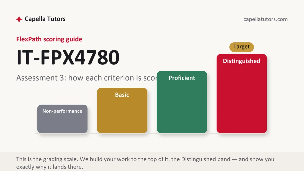
How IT FPX 4780 Assessment 3 is scored
Nothing is scaled and nothing is combined. A criterion arrives at one of four levels, and the description of the highest one is the most precise instruction you will be handed:
| Level | What it means on an accessibility and testing deliverable |
|---|---|
| Distinguished | Accessibility claims carry measured numbers and a real reader pass on a device, permissions are requested at the point of need with the rationale string written out, and the test table contains failures that were fixed. The criterion asks for one thing past a working build, and it says which. |
| Proficient | Labels, contrast and targets are addressed and the tests were run. Complete and credible, one step below the top because the evidence is described rather than shown. |
| Basic | Accessibility promised in a closing paragraph and testing summarized as thorough. Plausible claims with nothing a marker can check land here consistently. |
| Non-performance | A required element is simply not present, most often the measured contrast values or the test results. Absence is punished harder than partial work. |
This is also the artifact you are most likely to show somebody outside the courseroom. A test table with dates, device models and a fixed defect in it reads as professional work in a way that a screenshot of a finished screen never does.
The IT FPX 4780 Assessment 3 method, step by step
-
Map criteria to evidence before you test anything
One row per criterion: the claim, the artifact that will support it, and how that artifact gets produced. A row with nothing in the artifact column is either a task still outstanding or a claim you should be softening into a limitation, and telling those two apart early is worth an hour.
-
Label every control a reader has to announce
Icon-only buttons are the usual failure, since a magnifying glass with no accessible name is announced as nothing useful. Walk the whole primary task with the platform screen reader switched on, on a real device, and write down what it actually said rather than what you intended it to say.
-
Measure contrast and target sizes instead of judging them
Contrast is a ratio produced by a tool, so record the values for body text, for large text and for interface components separately. Target sizes are stated in the platform's own units, and a specification written in raw pixels tells a reviewer you have not understood why the minimums exist.
-
Test at doubled text and on a small screen
Turn the system text size up and see what wraps, what truncates and which button leaves the screen. Then do it again on the smallest device your audience plausibly owns. Two settings and two sizes catch most of what a marker would otherwise find in half a minute.
-
Request each permission at the moment of need
Ask for the least that answers the question, at the point in the task where the reason is obvious, with a short rationale string quoted in the document. A burst of requests at first launch reads as careless and is routinely refused by real users.
-
Write the test table with failures in it
Case, steps, device and system version, expected result, actual result, status and date, plus the defect it exposed and the retest that closed it. A table where everything passed on the first attempt reads as written afterwards rather than performed.
A structure that maps to the criteria
Internal targets for a closing evidence document, not published requirements; whichever criterion your guide leans on hardest deserves the extra length.
| Section | What it must do | Guide |
|---|---|---|
| Accessibility conformance | The target you are claiming, then labels, contrast values, dynamic type, target sizes and focus order, each with a measured result. | ~300 words |
| Screen reader walkthrough | The primary task walked with the platform reader on a named device, what was announced, and what you changed afterwards. | ~250 words |
| Permissions and privacy | Each permission, the moment it is requested, the rationale string shown to the user, and what the app does when it is refused. | ~250 words |
| Test plan and results | Cases with inputs, devices, system versions, expected and actual results, dates, and the defects the run produced. | ~300 words |
| Defects, fixes and retests | What broke, what you changed, and the retest that proves it, each traceable to the case that exposed it. | ~200 words |
| Limitations and sources | Devices and settings you could not cover, features scoped out, and guidelines cited by success criterion number in current APA. | ~200 words |
Annotated sample excerpt
One paragraph our team produced for a closing deliverable of this kind. Learn the moves, then generate your own measurements and report them the same way.
The volunteer shift signup task was walked end to end with the platform screen reader active on a 2022 mid-range handset running the current system release, and the reader announced the shift-claim control as "button" with no name, which made the app's single most important action unusable.1 Adding an accessible name of "Claim Saturday morning sorting shift, 9 to 12, four places left" fixed the announcement and also exposed a second problem, since focus jumped from the shift list straight to the footer and skipped the date filter that changes what the list contains.2 Measured contrast on the same screen was 4.71 to 1 for body text and 2.9 to 1 for the filter chips, so the chips were darkened to 3.4 to 1 rather than left at a value that reads acceptably to me and fails the standard for interface components.3
- 1Names the device, the system release and what the reader actually said. A quoted announcement is evidence; a claim that labels were added is not.
- 2Shows the fix and the second defect the fix revealed. Reporting the chain rather than the tidy outcome is what makes a testing section believable.
- 3Carries three measured ratios and the standard they were compared against. Numbers with a threshold beside them answer a criterion that adjectives cannot.
The full premium sample for your exact assessment, written fresh to your scoring guide and issue, is free to request. Study it, revise it into your own voice, and submit work you understand.
The five mistakes that cost Distinguished
- Accessibility handled in a closing sentence. Labels, contrast, target size and focus order are separate scored items, and a promise at the end satisfies none of them.
- Contrast described as good. A ratio comes from a tool, and a submission with no measured value has nothing for the criterion to grade.
- Every permission requested at launch. Asking for location, contacts and the camera before the user has done anything is refused by real users and marked accordingly.
- A single device and a single text size. Text that fits at the default on one emulator wraps at doubled size on a small handset and pushes the primary action off the screen.
- A test table with no failures. Cases that all passed first time and match the outcome exactly read as reconstruction rather than testing.
Pre-submission checklist
- Every criterion in the guide has its own labeled section
- Accessible name recorded for every control, including icon-only ones
- Measured contrast values for body text, large text and interface components
- Primary task walked with the platform reader on a named device and release
- Each permission requested at the point of need, with its rationale string quoted
- Test table with devices, dates, at least one failure, and the retest that closed it
Evidence section due and the tests not written?
Send the build or the recording, plus the criteria for this stage. Accessibility comes back with measured ratios and a reader transcript, permissions come back timed to the task with their rationale strings written, and the test table comes back with real failures and the retests that closed them. The first premium sample is free.