This manual is for IT FPX 4780 Assessment 1, start to submission. The opening deliverable in IT FPX 4780, Mobile Application Design and Development, normally asks you to define who the app is for, name the one job it exists to do, write that job out as numbered steps, and turn the steps into a screen inventory and a navigation model you can defend. Each criterion collects its own verdict against the guide attached to your assessment, and the design chain is what earns them. The order our tutors work in appears below, next to an outline drawn from the criteria and a passage annotated in the margin. Prefer to hand it off? A premium original sample for this exact assessment arrives in 24 to 48 hours with every screen traced to a step in the flow, and revisions are free until the guide is met. Capella's catalog lists the course as IT-FPX4780, and some courserooms print IT4780; both point to this same Assessment 1.
One honesty note before the manual: Capella revises courses and scoring guides over time, so always write to the exact scoring guide attached to your assessment in the courseroom. The course identity above is verified on capella.edu; the method and structure below are our tutors' approach to it, not Capella's official rubric text.
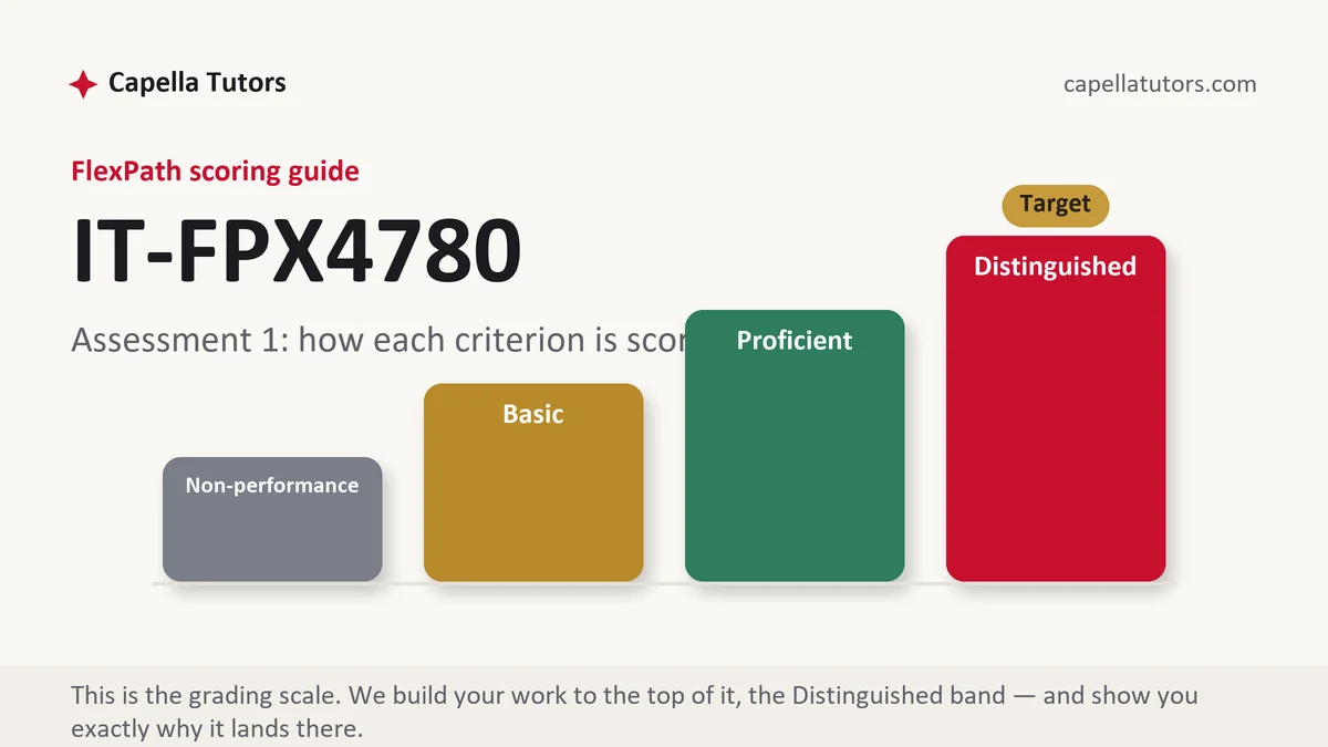
How IT FPX 4780 Assessment 1 is scored
No percentage and no letter is coming. Each criterion receives its own verdict at one of four levels, and the level text doubles as a specification:
| Level | What it means on a user and interface design deliverable |
|---|---|
| Distinguished | Every screen traces to a numbered step in the task flow, the tap count is justified rather than reported, and the conventions of both major platforms are answered where they disagree. The top column always names one move past complete, and it is printed in your guide for you to read. |
| Proficient | Users, task and screens are defined and internally consistent. Full work that stops where the criterion wanted a reason attached to the choice. |
| Basic | A gallery of screens with a persona bolted on the front. Attractive layouts that no stated user need asked for land here more often than ugly ones do. |
| Non-performance | A required element is not in the document at all, most often the task flow itself. An absent element sinks a criterion faster than a weak one. |
The chain you build here is load-bearing for the rest of the course. The state handling you specify next answers the question of what each screen needs to know when it is rebuilt from nothing, and that question is only answerable if the screen inventory exists first.
The IT FPX 4780 Assessment 1 method, step by step
-
Turn each criterion into a section before you sketch anything
The instructions describe an app; the criteria decide the mark. Give every criterion a heading, copy its top-level wording underneath, and note which ones require a measurement rather than a description. A beautiful screen filed under no criterion earns nothing.
-
Cut the app down to one job
Breadth is how marks are lost at this stage. Four partly drawn screens are worth less than one task followed from launch to confirmation with the blank case, the waiting case and the failed case all drawn. Write the job as a sentence a user would recognize, then decide what is deliberately out of scope.
-
Write the primary task as numbered steps and count the taps
Number the steps from launch to completion, count the taps, then defend the count. An app whose reason for existing takes seven taps to reach has a structural problem that no palette repairs, and saying so yourself is worth more than hoping the marker misses it.
-
Derive the screen inventory from the flow, never the reverse
Each screen must point at the step that produced it. Then list, for each screen, what it needs to know in order to redraw itself from nothing, because that list is the specification your state handling will be graded against later.
-
Choose the navigation model and answer both platforms
Tabs, a stack or a drawer is a decision with consequences, so name what your choice suits and what it makes awkward. Then deal with the disagreement between the two dominant systems, where one expects a system-level back behavior on every screen and the other puts navigation in the header.
-
Write the rationale in threes
Every significant decision gets what you chose, what you rejected, and the constraint that decided it, with the platform guideline named by its section rather than gestured at. Three sentences per decision is the cheapest route from Proficient to the top column in this course.
A structure that maps to the criteria
These lengths are internal targets for an opening design document rather than anything Capella states; give the extra words to whichever criterion your guide weights most.
| Section | What it must do | Guide |
|---|---|---|
| Audience and context of use | Who uses the app, where they are standing when they use it, what device and connection they have, and what evidence you have for any of it. | ~250 words |
| The primary task | The single job the app exists for, written as numbered steps from launch to completion, with the tap count stated and defended. | ~250 words |
| Screen inventory and states | Each screen tied to a step, plus what empty, loading, error and success look like on the screens where they can occur. | ~300 words |
| Navigation and layout system | The navigation model chosen and rejected, the type scale and spacing, and how the layout behaves on a small phone. | ~250 words |
| Design rationale | Chosen, rejected, and the deciding constraint for each significant decision, with the platform guideline cited by section. | ~300 words |
| Limitations and sources | Devices you could not test, features scoped out, and platform documentation cited by section with a retrieval date in current APA. | ~150 words |
Annotated sample excerpt
A single paragraph from a model our team assembled for work of this shape. Read it for the moves rather than the particulars, then rebuild them around the app your own brief describes.
The app exists to answer one question standing at a curb in the rain, which is when the next bus reaches this stop, and everything else in the transit authority's brief is secondary to that sentence.1 The flow is four steps and three taps: launch, accept or confirm the nearest stop, read the next three departures, and optionally pin the stop for tomorrow, which means the core answer is on screen after one tap rather than after the four a menu-first structure would cost.2 That count is only achievable because the nearest stop is resolved on launch and shown as a correctable guess rather than asked for, so the design accepts a wrong stop occasionally in exchange for removing two taps from every correct case, and the empty state when no stop is within 400 meters is a search field rather than an error.3
- 1States the single job in the user's physical situation, not in product language. A one-sentence purpose is what every later screen gets measured against.
- 2Reports the tap count and immediately compares it with the structure it beat. A number with a comparison attached is an argument rather than a statistic.
- 3Names the trade the count depends on and then handles the failure case. Accepting a known cost in exchange for a stated benefit is the reasoning the top column describes.
The full premium sample for your exact assessment, written fresh to your scoring guide and issue, is free to request. Study it, revise it into your own voice, and submit work you understand.
The five mistakes that cost Distinguished
- A persona with no evidence behind it. An invented user with a name and a photograph decides nothing, while one observation or interview by role and date decides several criteria.
- Screens that no step in the flow asked for. The first thing a reviewer does is look for the step behind each screen, and an orphan screen is the most visible failure in the document.
- The tap count reported and not defended. A number on its own is a measurement, and the criterion is asking whether the number is the right one.
- One platform's conventions copied onto the other. An interface that ignores a system back behavior is broken on one of the two systems before any logic runs.
- States left to the happy path. Empty, loading and error are screens too, and a design that only draws success is incomplete rather than optimistic.
Pre-submission checklist
- Each criterion in the guide carries its own labeled section
- The primary task written as one sentence a user would recognize
- Numbered flow from launch to completion, with the tap count defended
- Every screen traced to a step, with empty, loading and error drawn
- Chosen, rejected and deciding constraint written for each key decision
- Platform guidelines cited by section with a retrieval date, current APA both ways
Design document due and the flow still moving?
Send the app brief and the criteria attached to it. The primary task comes back as a numbered flow with the tap count argued, the screen inventory comes back traceable step by step, and every design decision comes back with the option it beat written beside it. Your first premium sample is free.