Give us the scenario, the criteria, and any diagram you have started, and a premium original sample returns inside 24 to 48 hours with the design argued rather than merely drawn, every figure carrying a legend and a walk-through a non-technical reader can follow. Your program plan lists this one as IT FPX 3249, Software Architecture and User Experience Design, worth 3 program points, a core requirement across both FlexPath specializations of the BS in Information Technology, which asks for at least 90 program points and a minimum of 27 of them at the 3000 level or above. In Capella's catalog the course code is written IT-FPX3249.
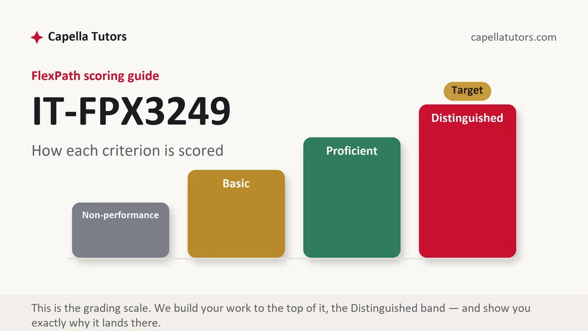
What IT FPX 3249 actually grades
This course puts two disciplines in one shell and grades the seam between them. On one side is structure: taking a described system apart into components, deciding what talks to what, choosing a pattern, and defending the choice. On the other side is the person using the result: who they are, what they are trying to finish, where the interface gets in their way, and what evidence you have for saying so. The criteria almost always ask you to connect the two, because the arrangement you pick behind the screen sets limits on the experience in front of it, and a design document that treats them as unrelated chapters reads as two half-assignments stapled together.
The architecture vocabulary is examinable and precise. Layered and three-tier arrangements, client and server responsibilities, the model-view-controller separation and its descendants, a single deployable application against a set of independently deployed services, and event-driven communication where a component publishes rather than calls. Underneath the patterns sit the quality attributes, and these are the currency the top column trades in: performance, availability, scalability, security, maintainability, portability, usability. The habit to build early is refusing to let an attribute stay an adjective. The system will be reliable is not a requirement anybody can check. A scenario is: when the primary database node fails during business hours, the application continues serving read requests and resumes accepting writes within four minutes, with no confirmed order lost. Source, trigger, condition, response, and a measure. Write three of those and the whole architecture section acquires something to be judged against.
The experience side is graded on method rather than on taste. Personas need a basis, so a persona built from interview notes, support tickets, or a survey is evidence and a persona invented to justify a design you already drew is decoration. Task flows come before wireframes, wireframes stay low fidelity until the flow is settled, and a heuristic evaluation is run against a named set, most often the ten usability heuristics associated with Jakob Nielsen, with each finding tied to the heuristic it breaks and rated for severity. Accessibility belongs in this section rather than in an appendix, since contrast, focus order, target size, and text alternatives are design decisions and not a compliance chore bolted on at the end.
How we help in this course
Design deliverables from us arrive argued. Components are named for what they own rather than for what they contain, every diagram comes with the legend and the numbered walk-through that makes it legible to a reader outside the field, quality attributes appear as scenarios with measures attached, and each significant choice is recorded in a short decision entry that states the alternatives and the cost of the option we took. Send the scenario your faculty gave you, along with any constraint about team size, budget, or hosting, and the design will fit that scenario instead of describing an enterprise nobody in the case study can afford.
The rest of the arrangement is the studio's usual one. Turnaround runs 24 to 48 hours, the target is the Distinguished descriptor rather than a passing grade, and eight people handle the work in sequence: research pulls the scoring guide and the standards, a subject writer designs and drafts, a scoring-guide reviewer scores the draft row by row as your evaluator will, an APA and originality pass verifies every citation against the list, and an editor closes the file. Revisions carry no charge until the guide is met, and returned faculty feedback re-enters the queue free. With two business days sitting between a submission and a result, an extra rewrite before you submit is usually cheaper than an extra attempt after.
The assessments, one by one
Assessment 1
The first deliverable in Software Architecture and User Experience Design usually asks you to describe a system before designing it: who uses it, what they are trying to finish, and what the software has to be good at, written so a reader could test each claim. Read the full Assessment 1 manual.
Assessment 2
The middle deliverable in this course usually turns requirements into structure: components with responsibilities, interfaces between them, a pattern the arrangement follows, and a written record of each choice you made along the way. Read the full Assessment 2 manual.
Assessment 3
The later work in this course usually asks for the human side of the design: personas with a basis, task flows before screens, low-fidelity wireframes, and an evaluation that produces findings rather than opinions. Read the full Assessment 3 manual.
How to actually write IT FPX 3249: where to begin
Turn the scoring guide into your outline before you draw a single box. One heading per criterion, the Distinguished wording pasted underneath, and then a rule you keep for the whole document: no figure appears without a paragraph that reads it aloud. Design work fails in this course less from bad design than from silent design, and the silence is always the same shape, a handsome diagram followed by a sentence saying the system is shown above. The person scoring the row is checking whether you can say what the picture means, and the picture cannot do that for you.
Then learn the one format this course exists to teach, the short decision record, which is how a technical choice gets scored by somebody who does not build systems. Take session state as the worked example. Context: the application will run behind a load balancer on two application servers, and a deployment restarts one server at a time during business hours. Decision: session state goes in the shared database rather than in each server's memory. Alternatives: keeping sessions in memory, which is the fastest option and logs a signed-in user out whenever their server restarts unless traffic is pinned to one machine, and adding a dedicated cache, which is faster than the database and introduces a component somebody has to operate, monitor, and patch. Consequences: one extra read on each authenticated request, roughly a few milliseconds against a target that allows several hundred, in exchange for a signed-in user surviving a mid-afternoon deployment. Status: accepted, revisit if authenticated traffic triples. Five short blocks, no jargon that goes unexplained, and every one of them is a sentence an evaluator can mark.
Do the same on the experience side by writing findings as evidence rather than as opinion. The weak version says the checkout page is confusing and should be improved. The version that scores says three of five participants stopped at the second step because the only forward control read Continue and gave no indication that payment came next, that this breaks the heuristic about visibility of system status, that severity is high because the task cannot be completed without guessing, and that the fix is a labelled step indicator with the current step named. Observation, heuristic, severity, remedy. Repeat the pattern for each finding and put them in a table, because a table of findings is easier to score than four paragraphs and evaluators reward being easy to score.
| Section | What goes in it | What Distinguished looks like |
|---|---|---|
| Problem and users | The system in one paragraph, the people who use it, and the tasks they need to finish. | Users described from evidence, with the primary task named and the secondary ones ranked below it. |
| Requirements | Functional needs plus quality attributes written as scenarios with conditions and measures. | Every attribute measurable, and the two that conflict identified before the design starts. |
| Architecture | Components, responsibilities, interfaces, data flow, and the pattern the arrangement follows. | A consistent notation, a legend, and a request traced end to end in numbered steps. |
| Decision records | Each significant choice with its context, alternatives, consequences, and current status. | Rejected options given their fair case, and the cost of the accepted option stated plainly. |
| Experience artifacts | Personas, task flows, wireframes, and the accessibility considerations built into them. | Artifacts that reference each other, so a wireframe answers a step in a flow a persona needs. |
| Evaluation and sources | Heuristic review or usability test, findings with severity and fixes, references in current APA. | A stated protocol, findings tied to named heuristics, and standards cited rather than paraphrased. |
Developing the analysis
Architecture is the study of what you give up, so a submission with no sacrifice in it has not made an argument yet. Take the tension that runs through most scenarios in this course, between a design that is quick to change and a design that is quick to run. Normalizing the data keeps it consistent and makes some reports slower; caching those reports makes them fast and lets a user see a number that is two minutes stale. Neither is correct on its own, and the criteria are not asking you to be correct, they are asking which constraint in your scenario decides it. Say that a two-minute delay on a dashboard is acceptable while a two-minute delay on stock availability is not, and the design has an argument that can be checked. The same discipline applies on the interface side, where a shorter form raises completion and collects less of what the business wanted, and choosing one means naming the number you were willing to lose.
Citations that survive faculty review
Four kinds of source carry the weight in a design paper. Standards bodies supply definitions you should not improvise, so product quality characteristics come from the ISO and IEC systems and software quality model, human-centred design process language comes from the ISO ergonomics standard for interactive systems, and accessibility criteria come from the Web Content Accessibility Guidelines with the version stated. Established architecture texts and the technical report series from the Software Engineering Institute at Carnegie Mellon supply the method, including quality attribute scenarios and structured evaluation. Usability findings from the Nielsen Norman Group and peer-reviewed human-computer interaction research pulled through the Capella library carry any claim about how people behave, which is exactly the claim students most often make from personal impression. Attribute patterns to where they came from rather than to the blog that summarized them, so model-view-controller traces back to the Smalltalk work of the late nineteen seventies and the classic catalogue of design patterns to its own authors. Then reconcile the reference list against the text in both directions in current APA, and give any online source a retrieval date if the page is one that changes.
The mistakes that land Basic instead of Distinguished
- A diagram with no legend and no narration. Unlabelled boxes prove you own a drawing tool, nothing more.
- Quality attributes written as adjectives. Fast, secure, and scalable are not requirements until a number and a condition are attached.
- Personas assembled from imagination. A user invented after the design exists is there to agree with you.
- A pattern chosen because it is fashionable. The criterion asks what the pattern solves in this scenario, not whether you have heard of it.
- Findings without severity or a fix. A list of complaints is not an evaluation, and an evaluator will score it as one.
IT FPX 3249 questions students actually ask
Which diagramming tool am I supposed to use?
Whichever one you can label properly, because nobody scores the tool. What gets scored is whether the notation stays consistent, whether every box and arrow is named, and whether a legend tells the reader what a rectangle means in your drawing and what a dashed line means as against a solid one. Pick one convention and hold it for the whole submission, so a box is always a deployable component or always a logical layer and never both. Then write the walk-through underneath the figure, following one request from the interface through each element it touches until a response comes back, since a figure with no accompanying narrative is the single most common way a design criterion drops to Basic.
How many people do I need for a usability test at this level?
Around five is the working number the usability literature has settled on for finding the majority of problems in a single interface, and the criteria are almost never scored on sample size anyway. They are scored on protocol. Write the task list before you recruit, phrase each task as a goal rather than as an instruction naming the button, decide in advance what counts as success and what counts as a failure, and record what participants did as well as what they said. Report who they were and how they were recruited, because five colleagues who already use the system are not the same evidence as five people meeting your persona criteria, and saying so honestly reads better than a sample you quietly oversell.
Do I have to choose microservices to look current?
No, and choosing them without an argument is a faster route to Basic than choosing a monolith with one. The criteria reward a decision tied to constraints, and the constraints in a course-sized scenario usually favor a single deployable application with clean internal boundaries, because a distributed design brings network failure, data consistency across services, and an operations burden that a small team cannot staff. Say that out loud. Name the condition that would change your mind, such as one part of the system needing to scale independently or two teams needing to release on separate schedules, and you have shown the evaluator you understand what the pattern is for rather than that you have heard of it.
Design document stuck at the diagram?
Send the scenario, the criteria, and whatever you have drawn so far. You get the components, the decision records, and the narration that makes them scoreable. No charge on the first premium sample.