This manual is for IT FPX 3249 Assessment 2, start to submission. The middle deliverable in this course usually turns requirements into structure: components with responsibilities, interfaces between them, a pattern the arrangement follows, and a written record of each choice you made along the way. A diagram earns nothing by itself, because the criterion is scored from the paragraph that reads the diagram aloud. Ahead: the method, a structure built from the criteria, and one annotated model excerpt. Want it built with you? Hand over the scenario and a premium original sample returns in 24 to 48 hours, revised at no charge until each row is satisfied. Capella's catalog lists the course as IT-FPX3249, and some courserooms print IT3249; both point to this same Assessment 2.
One honesty note before the manual: Capella revises courses and scoring guides over time, so always write to the exact scoring guide attached to your assessment in the courseroom. The course identity above is verified on capella.edu; the method and structure below are our tutors' approach to it, not Capella's official rubric text.
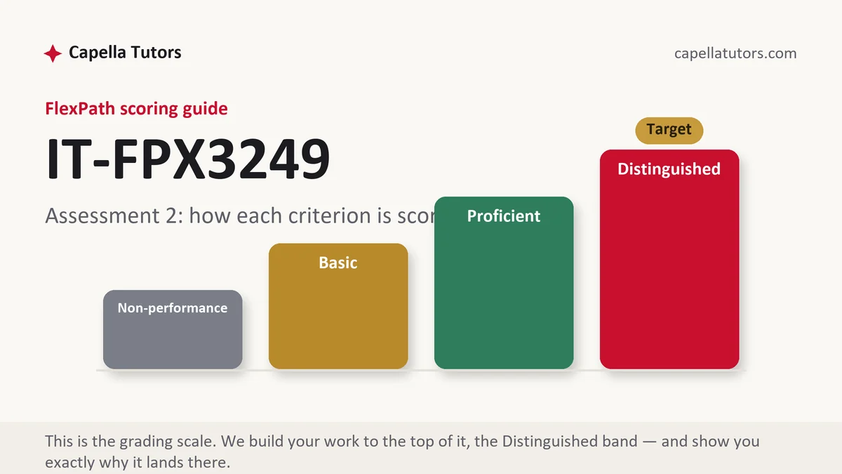
How IT FPX 3249 Assessment 2 is scored
Four levels per criterion, no percentages, no letter grade. What the level says is what your text has to do:
| Level | What it means on an architecture and decision-record submission |
|---|---|
| Distinguished | The notation stays consistent, a legend explains it, one request is traced end to end in numbered steps, and each decision record gives the rejected option its fair case. That fairness is the move being paid for. |
| Proficient | Components, interfaces, and a pattern are all present and defensible. Correct, with the alternatives unmentioned. |
| Basic | A handsome drawing followed by a sentence saying the system is shown above. Silent design is the classic result here. |
| Non-performance | A required artifact is absent, most often the data flow or the pattern justification, or boxes appear with no names at all. |
Consistency is worth more than detail in this deliverable. Decide once whether a box means a deployable unit or a logical layer, hold that meaning for every figure, and put the rule in a legend. A drawing that switches meaning halfway through cannot be walked through, and a design that cannot be walked through cannot be scored above Basic.
The IT FPX 3249 Assessment 2 method, step by step
-
Build the outline from the criteria, then hold one rule
Set the criteria out as headings first. Then adopt the rule that decides this deliverable: no figure appears without a paragraph beneath it that reads the figure aloud. Apply it without exception and half the marking is already answered.
-
Decompose by responsibility, not by folder
Name each component for what it owns rather than for what it contains, so a trip planning kiosk yields a journey search service that owns route and timetable queries, a fare component that owns pricing rules, a printing component that owns the physical receipt, and a content component that owns service alerts. Ownership is what lets you say who talks to whom.
-
Draw once, label everything, then walk one request
Produce a single diagram with a legend explaining what a rectangle means and what a dashed line means against a solid one, number the components, and then follow one request through in numbered steps: a rider taps a destination, the kiosk calls journey search, journey search reads the timetable store, the fare component prices the result, and the screen renders. Numbered narration is the cheapest way to earn a design criterion.
-
Choose a pattern and defend it against the fashionable one
Say which arrangement you picked and what it solves in this scenario. A single deployable application with clean internal boundaries usually fits a county agency running twelve kiosks, because splitting into independently deployed services adds network failure, data consistency work, and operations nobody is staffed to do. Then name the condition that would change your mind, such as one component needing to scale on its own.
-
Write short decision records, one per real choice
Five blocks each: context, decision, alternatives, consequences, status. Do this for the choices that would be expensive to reverse, including where offline behavior lives, how the timetable is cached, and whether the kiosk holds any rider data at all. Give each rejected option its honest advantage, because a straw man is visible and it costs you the criterion the record exists to earn.
-
Read it as an outsider, self-score, and submit
Hand the document to somebody who does not build software and watch where they stop. Every stall is a paragraph the evaluator will also stall on. Fix those, mark yourself against each row, and upload early in the week so a two business day evaluation still leaves time to revise.
A structure that maps to the criteria
These are the word targets our tutors plan against for a design document of this size, not Capella rules; your own scoring guide decides the real weighting.
| Section | What it must do | Guide |
|---|---|---|
| Context and drivers | The requirements and constraints the structure has to satisfy, restated in a paragraph and referenced later. | ~150 words |
| Component decomposition | Each component with the responsibility it owns, its interface, and what it depends on. | ~300 words |
| The diagram and its walk-through | One consistent figure with a legend, plus a request traced through it in numbered steps. | ~250 words |
| Pattern and rationale | The arrangement you chose, what it solves here, and the option you rejected with its fair case. | ~250 words |
| Decision records | Context, decision, alternatives, consequences, and status for each expensive choice. | ~300 words |
| Sources | Architecture method texts and standards cited directly, patterns credited to their origin, current APA. | as needed |
Annotated sample excerpt
One decision record from a model document our team wrote, at the length and register the top column describes. Copy the shape, not the content.
Context: the kiosks sit outdoors on a mobile connection that drops for minutes at a time, and a rider standing in front of a blank screen will walk to the next stop.1 Decision: the timetable is cached on each kiosk and refreshed hourly, while live service alerts are fetched on demand and simply omitted when unavailable. Alternatives: fetching everything live, which is always accurate and useless during an outage, and caching alerts too, which keeps the screen full and risks telling a rider a suspended route is running.2 Consequences: a rider can plan a normal journey during an outage and cannot learn about a disruption, so the screen states the age of the alert feed in every case.3 Status: accepted, revisit if outages exceed thirty minutes.
- 1Opens on the constraint rather than on the technology, so the decision has something to be judged against before it is made.
- 2Gives both rejected options a real advantage, which is what stops the record reading as a decision defended after the fact.
- 3States the cost of the accepted option and the mitigation in the same breath. Naming what you gave up is the top-column move.
The full premium sample for your exact assessment, written fresh to your scoring guide and issue, is free to request. Study it, revise it into your own voice, and submit work you understand.
The five mistakes that cost Distinguished
- A figure with no legend and no narration. Unlabelled boxes prove you own a drawing tool, and the design row is scored from the prose.
- Notation that shifts meaning mid-document. If a rectangle is a service on one page and a layer on the next, no reader can trace a request.
- A pattern chosen because it sounds current. The criterion wants to know what the arrangement solves here, not that the name is familiar to you.
- Decision records with straw alternatives. An option listed only to be dismissed shows the choice was made before the analysis.
- Components named after the files they hold. A box called utilities owns nothing, and an interface you cannot name is a dependency you have not designed.
Pre-submission checklist
- Every figure followed by a paragraph that reads it aloud
- One legend, one notation, and the same meaning held across all figures
- Each component named for the responsibility it owns, with its interface stated
- One request traced end to end in numbered steps that match the labels
- A decision record per expensive choice, each rejected option given its real advantage
- Read by a non-specialist, self-scored per row, and submitted early in the week
Diagram drawn and the rationale missing?
Send the scenario, the criteria, and whatever you have sketched. You get components named for what they own, a legend and a numbered walk-through, and decision records that give the rejected options a fair hearing, back inside 24 to 48 hours. Free revision until the guide is met, and no fee on the first premium sample.