This manual is for IT FPX 3240 Assessment 1, start to submission. The opening deliverable in Web Development and JavaScript is usually where the page gets its skeleton: elements chosen for meaning, a stylesheet that survives a phone, and a short document telling an evaluator which file and which lines answer which criterion. Two things get graded, the build and the account of it, and undergraduates lose more points on the second. What follows is the method our tutors run on this deliverable, a structure keyed to the criteria, and an annotated excerpt from a model. Rather hand it over? A premium original sample written to your own scoring guide comes back in 24 to 48 hours, revised free until it satisfies every row. Capella's catalog lists the course as IT-FPX3240, and some courserooms print IT3240; both point to this same Assessment 1.
One honesty note before the manual: Capella revises courses and scoring guides over time, so always write to the exact scoring guide attached to your assessment in the courseroom. The course identity above is verified on capella.edu; the method and structure below are our tutors' approach to it, not Capella's official rubric text.
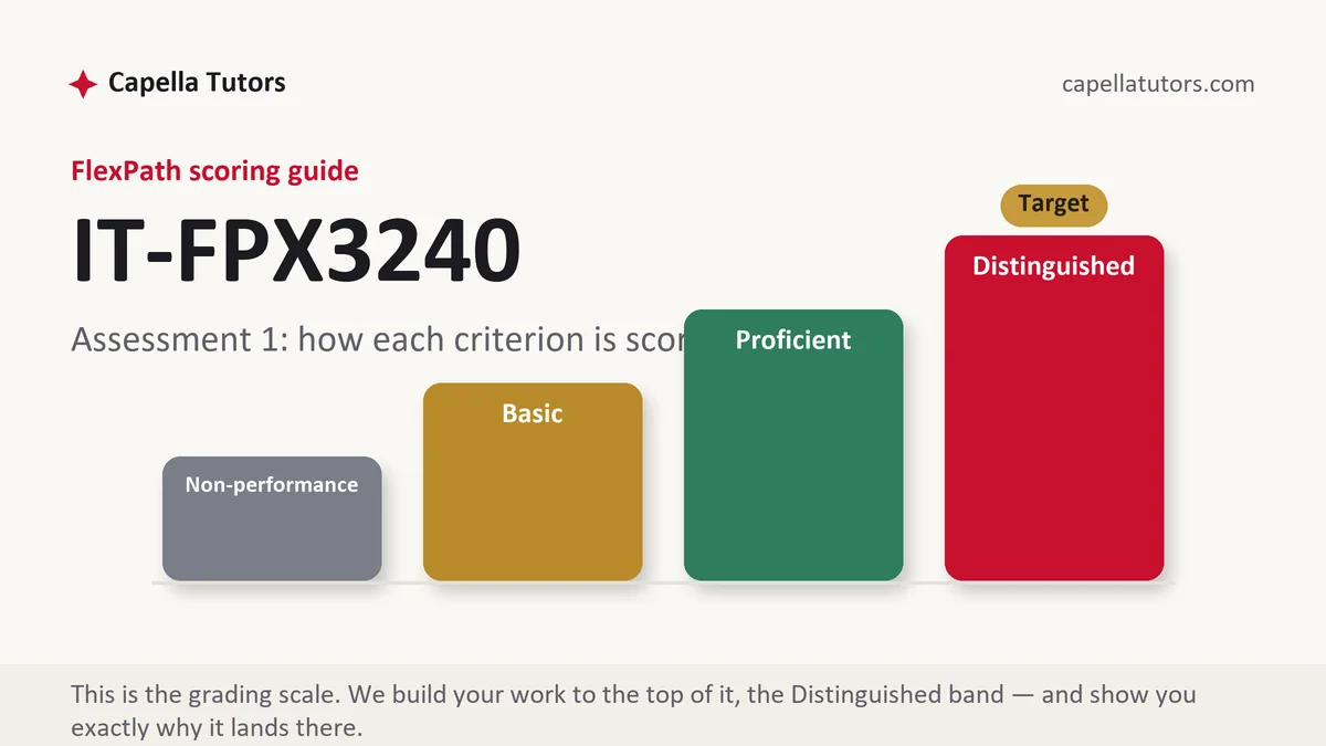
How IT FPX 3240 Assessment 1 is scored
FlexPath issues no letter grades. Each criterion on your scoring guide lands on one of four levels, and the level wording is the brief you write to:
| Level | What it means on a markup and styling submission |
|---|---|
| Distinguished | Elements are chosen for meaning, each choice is defended in one line, and the write-up names a content problem the structure had to solve. That extra move is written into the criterion; find it and make it. |
| Proficient | Every requirement in the prompt is present and the page holds together. Correct, and still one sentence short of the top of the column. |
| Basic | A page that looks right, explained with a screen capture and a caption. The usual landing spot when the document was written after the build. |
| Non-performance | A required element is missing, most often the responsive behavior or the accessibility work. Absent, not weak, is what puts a row on the floor. |
Read that second column as advice about where your hours go. Polish moves nothing, because no criterion here scores taste. Writing down why the navigation sits in a nav element and why a label carries a for attribute moves two rows at once.
The IT FPX 3240 Assessment 1 method, step by step
-
Turn the scoring guide into a file map
Copy each criterion into a blank document as a heading, paste its Distinguished wording underneath, and add two columns beside it: the file that answers it and the line range inside that file. Build work fails on coverage more often than on skill, and the map is what stops you from perfecting a layout and never reading the accessibility row.
-
Choose a page with awkward content behind it
Pick real information rather than a tidy demo. A municipal library branch publishing its monthly event calendar hands you dates, age ranges, a room name, a registration link, and one cancelled session, and awkward content forces genuine structural decisions. Placeholder text lets you dodge every one of them.
-
Write the markup before you write a single rule
Build the document as an outline with nothing styled, then read it back with the stylesheet switched off. Headings should descend without skipping, navigation belongs in a nav, a control that acts is a button and a control that travels is an anchor, and every label should name its field through a for attribute matching that field's id. If the unstyled page reads as a sensible document, the semantics criterion is already answered.
-
Lay out with flexible units and let content set the breakpoint
Pick one layout method and say which in writing. Size with relative units so a reader who enlarges text keeps the column. Put the breakpoint where your content starts to break rather than at a width named after a device, and record the reason, because a justified breakpoint reads as engineering and a borrowed one reads as a tutorial.
-
Test the page the way an evaluator might, and record it
Walk the whole page using the keyboard alone and confirm the focus indicator is visible at every stop. Narrow the window until the layout gives up and write down that width. Run the markup through a validator and repair what it reports. Capture the wide state, the narrow state, and one state that failed before you fixed it.
-
Self-score, then submit early in the week
Read the draft against the guide one row at a time and mark yourself D, P, B or N without generosity. Anything under D gets another pass. Send it Monday or Tuesday, since an evaluator has up to two business days and a Thursday submission can sit until the following week.
A structure that maps to the criteria
Word counts are planning targets our tutors use for the document that travels with a build, not Capella rules; expand any section your scoring guide weights heavily.
| Section | What it must do | Guide |
|---|---|---|
| Requirement map | Each criterion beside the file and line range that satisfies it, plus how to open the page on a machine that is not yours. | ~150 words |
| Structure decisions | The elements you selected, what each one means, the heading order, and one defended sentence per choice. | ~300 words |
| Presentation decisions | The layout method, the units, the breakpoint, and why the breakpoint sits where you put it. | ~250 words |
| Accessibility | Label binding, alternative text, contrast, focus visibility, and the keyboard path from the top of the page to the bottom. | ~250 words |
| Testing evidence | Browsers and versions, widths checked, validator output, and one defect you found and repaired. | ~200 words |
| Sources | Specifications and documentation cited for any behavior claim, adapted code credited twice, current APA both ways. | as needed |
Annotated sample excerpt
An original model excerpt built by our team, set at the register the top column pays for. Read it for the moves, then draft your own version.
The event list is marked up as an unordered list of articles rather than as a table, because each entry is a self-contained item with its own heading and date and not a row of comparable cells.1 Cancelled sessions keep their place in the list and carry the word cancelled in the text, since deleting them would leave a reader who bookmarked the page unable to tell whether a session moved or vanished.2 Each registration control is an anchor because it travels to the booking system, while the room filter is a button because it changes this page in place.3
- 1Names the option that was rejected and the property of the content that decided it. A defended choice scores; a correct choice stated flatly does not.
- 2Turns a content problem into a structural decision, which is exactly what a criterion about appropriate markup is written to find.
- 3Separates two controls that look identical on screen by what each one does. One sentence, two criteria touched.
The full premium sample for your exact assessment, written fresh to your scoring guide and issue, is free to request. Study it, revise it into your own voice, and submit work you understand.
The five mistakes that cost Distinguished
- A page assembled from generic containers. Nested divs styled to resemble headings and buttons fail the semantics row however good the page looks.
- Styling written into the markup. Inline style attributes contradict the separation the guide is checking for, and an evaluator sees them in one glance.
- Labels placed beside fields and never bound to them. A label with no for attribute is decoration, and assistive technology announces nothing at all.
- A breakpoint copied from a tutorial. Widths named after last year's phones date immediately, and the criterion wants the reason rather than the number.
- A folder that only opens on your own machine. Absolute paths and mixed-case file names turn a finished build into an unscored one.
Pre-submission checklist
- Every criterion has a labeled section and a named file behind it
- The page still reads as a sensible document with the stylesheet switched off
- Every field has a label bound by a for attribute matching its id
- Keyboard path walked end to end with the focus indicator visible at each stop
- Validator run, output included, each reported issue fixed or explained
- Self-scored D on every row, folder opened from a fresh location, submitted early in the week
Assessment 1 due and the layout is fighting you?
Send the prompt, the scoring guide, and whatever folder you have managed to assemble. You get validated markup, an organized stylesheet, and the document that maps both of them to your criteria, back inside 24 to 48 hours with revisions until the guide is met. The first premium sample carries no fee.