In Capella's MBA sequence, MBA FPX 5008, core Applied Business Analytics, carries 2 pts / 4 qcr and runs in FlexPath. In Capella's catalog the course code is written MBA-FPX5008.
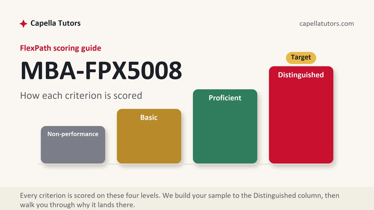
What MBA FPX 5008 actually grades
Analytics for decision-makers: interpret data, visualize it honestly, and convert findings into business action. The criteria consistently reward the last mile, so-what stated as a decision with a dollar or operational consequence, and penalize dashboards described without conclusions. Students comfortable with numbers often stumble on narrating them.
How we help in this course
We draft the narration layer that analytics rubrics actually grade: findings stated plainly, visuals chosen to carry one point each, recommendations that commit. Where the assessment includes the analysis itself, the workbook arrives clean and the write-up matches it cell for cell.
Orders here get the standard machinery: your scoring guide decoded by the research analyst, a subject-matched writer, scoring-guide QA then APA and originality QA, delivery inside 24 to 48 hours, and the revise-until-target guarantee.
Assessment manuals for this course
Every assessment in MBA FPX 5008 has its own manual now: the walkthrough, the structure that maps to the criteria, an annotated sample excerpt, and the done-for-you door. Open Assessment 1, Assessment 2, Assessment 3, or start from the list in the sidebar.
In MBA FPX 5008 right now?
Send the assessment number and the scoring guide from your courseroom. First premium sample free, back in 24 to 48 hours.
The last mile is the graded mile
Analytics scoring guides at Capella concentrate their weight on the ending most students rush: the so-what, stated as a decision with a dollar or operational consequence. Dashboards described without conclusions sit in the Basic column by definition, because description is summary wearing a chart. Our 5008 drafts write the narration layer the criteria actually price, findings stated plainly, each visual carrying exactly one point, recommendations that commit to an action, and where the assessment includes the analysis itself, the workbook ships clean and the write-up matches it cell for cell.
A quick reality check for the numbers-comfortable
If you can run the analysis but your evaluations keep coming back a column short, the gap is almost certainly narrative, and it is the cheapest gap in the MBA to close. Send one returned evaluation alongside the next assessment's scoring guide; the scope reply will show you, criterion by criterion, where the words fell short of the math, before any drafting begins. Returned evaluations are FlexPath's best diagnostic instrument, and most students never use them; the desk reads them line by line.
Does the desk build the visualizations too?
Yes, chosen to carry the argument rather than decorate it, since the criteria read visuals as claims that need support like any other.
What is the honest turnaround on a data-heavy assessment?
The standard window holds, 24 to 48 hours through the eight-person pod with both QA passes, and the free first draft applies here like everywhere else.
The assessments, one by one
Assessment 1: Interpreting Graphical Representations of Data in Articles or Reports
Read and interpret the charts in an article or report, judge whether they represent the data fairly, and explain what they show for a business question. Read the full Assessment 1 manual.
Assessment 2: Using Analytic Techniques to Add Meaning to Data
Build graphs and descriptive statistics for a company's data, such as sales by segment and stock prices, and interpret what they mean. Read the full Assessment 2 manual.
Assessment 3: Applying Analytic Techniques to Business
Analyze a company's data with histograms, scatterplots and descriptive statistics, interpret the relationships, and recommend actions. Read the full Assessment 3 manual.
How to actually write MBA FPX 5008: where to begin
Start with the scoring guide. Download it from the courseroom, turn every criterion into a section heading in a blank document, and paste the Distinguished description under each. Analytics assessments make this step feel skippable because a dataset is sitting there asking to be opened, but the guide tells you what the analysis is for, and analysis without a graded destination is the most common wasted work in this course. A typical 5008 assessment hands you data or statistical output, asks you to interpret it, present it visually, and convert it into a business recommendation, and the criteria weight the interpretation and the recommendation more heavily than the computation.
Then meet the data before you write a word. Open the dataset or the supplied output and answer four questions in notes: what each variable measures, what the descriptive statistics say, mean, median, spread, and range, where the outliers sit, and what business question this data can actually answer. The assessment is never really describe-this-data; it is what should a manager do differently because of this data, and every section you draft should be moving toward that answer.
Write the findings in plain English first, one sentence per statistic, before any formatting. Average order value rose while order count fell is a finding; the mean was 47.2 is not yet one. Those sentences become the spine of the paper and the captions of the charts.
| Section | What goes in it | What Distinguished looks like |
|---|---|---|
| Introduction | The business question the data can answer, and for whom. | The question stated as a decision someone has to make, not a topic. |
| Data and method | What the dataset covers, which statistics you ran, and why those. | The choice of statistic defended: median over mean when the spread demands it. |
| Findings | Descriptive statistics narrated in plain English, one point per paragraph. | Each figure paired with its spread and its meaning, never quoted alone. |
| Visualizations | Charts that each carry exactly one point the argument needs. | Chart type defended, axes honest, caption states the takeaway in a sentence. |
| Recommendation | The decision the numbers support, with its operational consequence. | A dollar or operational figure attached, plus what the data cannot say. |
Developing the analysis
The graded skill is reading outputs honestly, and the traps are specific. A mean without its spread is the classic: an average satisfaction of 7 hides a split between delighted and furious customers, and the split, not the average, is the finding. A truncated axis makes a two percent difference look like a cliff; state effect sizes in real units. Correlation narrated as cause fails the criterion silently: sales rising alongside ad spend is an association until you can rule out the season. Distinguished work names the statistic's limitation as part of the finding, what the number cannot tell you, and then argues from the numbers to the recommendation anyway: the data shows this, so the business should do this, and here is what it is worth. Tie each finding and each chart back to a criterion; anything serving no criterion is decoration the evaluator skips.
Citations that survive faculty review
Analytics papers still carry an evidence criterion, and students lose it by assuming the numbers cite themselves. Three kinds of claims need sources: methods claims, why the median, why this chart type, cited to a current analytics or statistics source; business-context claims, industry benchmarks or market facts, cited to industry data in the IBISWorld style or to the trade press through ABI/INFORM; and the dataset itself, cited as the courseroom supplies it. Keep sources within roughly five years, reach them through the Capella library, and put the citation inside the sentence doing the arguing, author and date at the claim. One well-placed methods citation per major choice reads as command of the material; a reference list of unused sources reads as padding.
The mistakes that land Basic instead of Distinguished
- Outputs reported without meaning. A table of statistics restated in prose is description, and description is the Basic column's definition.
- Decorative charts. A visual that repeats the table adds nothing; each chart must carry one point the argument needs.
- The missing recommendation. Analysis that ends at the findings leaves the heaviest criteria unanswered.
- Means without spread. Averages quoted alone conceal the distribution, and evaluators in this course look for exactly that.
- Cause claimed from correlation. Say associated with unless the design lets you say more, then note what would let you say more.
MBA FPX 5008 questions students actually ask
I am weak in statistics. Can I still score Distinguished?
Yes, because the criteria weight interpretation and recommendation over computation. The statistics in this course are means, medians, spreads, and simple relationships, mechanics a spreadsheet handles. What gets graded is what you say the numbers mean for the business, and that is a reasoning and writing skill, not a math one. Students comfortable with numbers routinely score lower than expected here for the mirror-image reason: they compute well and narrate nothing.
How many charts should the assessment include?
As many as you have points to carry, one point per chart. A typical submission lands between three and five: the finding that drives the recommendation always earns one, the spread behind a headline average usually earns another. Pick the type by the job, bars for comparison, lines for change over time, and give each a caption that states its takeaway in a sentence, because the caption is where the evaluator checks that you read your own chart.
Do I write this as an essay or a business report?
As the document the prompt's audience needs, which in 5008 is nearly always a management report: headed sections matching the criteria, findings up front, recommendation explicit. Scholarly register still applies to the evidence, citations in APA and claims sourced, but the shape is a briefing, not a literature essay. When the prompt names an audience, write to it, because the communication criterion is scored against that audience.