This manual is for NURS FPX 9030 Assessment 2, start to submission. Assessment 2 usually asks you to present what the project measured: process and outcome data laid out over time with stable denominators, a chart built the way improvement work is displayed rather than the way a spreadsheet defaults, and a reading of that chart using rules stated in advance. The criteria reward discipline over volume, and most of the marks live in whether every figure can be traced back to a count. Below sits our doctoral approach to the numbers, a structure paced to the criteria, and an annotated sample excerpt. Prefer to send us the numbers? A premium original sample for this exact assessment comes back within 24 to 48 hours, revised at no cost until the criteria clear. Capella's catalog lists the course as NURS-FPX9030, and some courserooms print NURS9030; both point to this same Assessment 2.
One honesty note before the manual: Capella revises courses and scoring guides over time, so always write to the exact scoring guide attached to your assessment in the courseroom. The course identity above is verified on capella.edu; the method and structure below are our tutors' approach to it, not Capella's official rubric text.
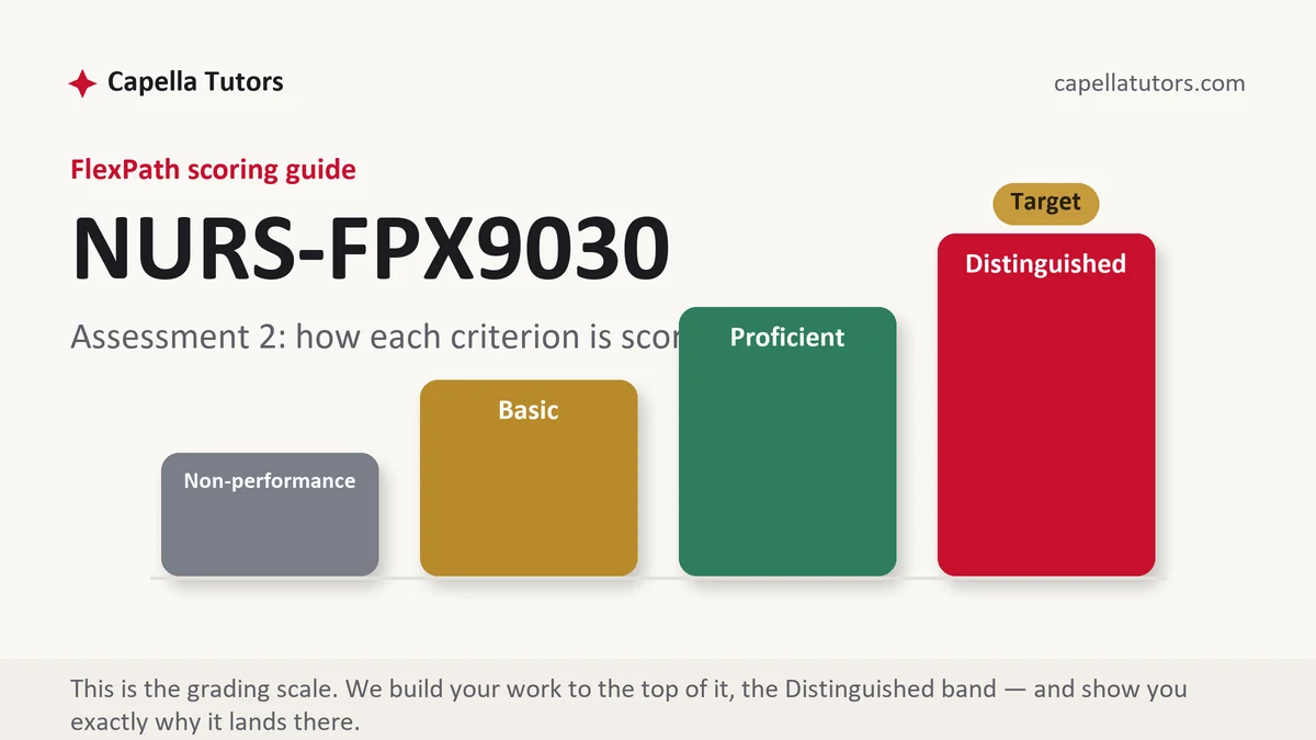
How NURS FPX 9030 Assessment 2 is scored
One level per criterion, awarded on what the section demonstrates rather than on effort. Here is how the descriptors read on a data submission:
| Level | What it means on a data and time-series submission |
|---|---|
| Distinguished | Measures are displayed over time with the baseline median extended into the implementation period, every point carries the denominator it was computed on, the reading follows a stated rule rather than the eye, and the kind of claim the data can support is named. The move past sufficiency is choosing the analysis your numbers can actually carry. |
| Proficient | Data reported completely and accurately, with before and after compared. Correct, and displayed as two bars where a series would have shown the pattern. |
| Basic | Percentages presented without their denominators, a pre and post comparison from two aggregated numbers, and a conclusion drawn by looking at the direction. |
| Non-performance | A required element is absent, most often the process measure data or the baseline period the comparison depends on. |
Two aggregate numbers cannot show you anything a series would not show you better. A rate of 41 percent before and 78 percent after conceals whether the change arrived in week two and held, drifted upward from week one for reasons that predate you, or spiked once and fell back. Plot every point, extend the baseline median forward, and let the display do the arguing.
The NURS FPX 9030 Assessment 2 method, step by step
-
Rebuild every rate from its raw counts
Put numerator and denominator in adjacent columns for every period and let the spreadsheet compute the percentage. Transcribed rates carry transcription errors, and the fastest way to lose a data criterion is a figure in the narrative that does not match the table above it.
-
Choose an interval that gives you enough points
Time-series reading wants roughly twelve to fifteen points on each side of the change, though your handbook or faculty may set something different that governs. Weekly process data on twenty audited charts yields twelve points in twelve weeks; monthly data over the same window yields three, which is three numbers rather than a chart.
-
Draw the median from the baseline and extend it
Compute the median across the baseline period only, then carry that line forward across the implementation period. A median recomputed over all the data absorbs your own effect and flattens the signal you are trying to show.
-
State the reading rules before you read
Six or more consecutive points on one side of the extended median is a shift, five points rising or falling in a row is a trend, and a single point far outside the established range is worth investigating on its own. Name the rules and cite the text you took them from, then apply them without improvising.
-
Put the weight on the measure with the bigger denominator
Rare outcomes produce a handful of events and cannot carry an analysis; process measures audited weekly produce hundreds of observations and can. Report both, and be explicit about which one your conclusions rest on and why.
-
Name the kind of claim, then self-score
Statistical significance is a claim about chance and clinical significance is a claim about whether the change matters to patients. On small numbers you will usually be arguing the second while conceding the first, and saying so plainly is the top of the column. Then mark each criterion honestly and rewrite anything below it.
A structure that maps to the criteria
Planning targets our tutors use for a data submission, not Capella requirements; tables and charts sit outside the prose count.
| Section | What it must do | Guide |
|---|---|---|
| Measures as collected | Each measure restated with the operational definition used, unchanged from the design, and the source of every count. | ~250 words |
| Process measure results | Weekly numerators and denominators, the audit method, and the sampling rule that produced them. | ~350 words |
| Outcome measure results | The outcome over time with the baseline period displayed alongside and the median extended. | ~300 words |
| Reading the display | The rules applied, cited to a source, and what they do and do not identify in your series. | ~250 words |
| Balancing measure | What the change cost elsewhere, reported with the same discipline as the measures that flatter you. | ~200 words |
| Claim and references | Which kind of significance the data supports, and current APA matched in both directions. | ~250 words |
Annotated sample excerpt
An original model paragraph from our team, showing how a series gets read without either overclaiming or hedging into silence.
Completion of a written asthma action plan was audited weekly at fifteen charts drawn from the school-based clinic's visit list, giving 180 observations across the twelve baseline weeks and 180 across the twelve implementation weeks, with the same eligibility definition applied throughout: any student aged five to seventeen with a documented asthma diagnosis seen for any reason.1 The baseline median was 46.7 percent, and the eleven implementation points from week two onward all sit above that extended median, which by the six-point rule cited in the run-chart literature is a shift rather than ordinary variation.2 The outcome measure, rescue inhaler administrations in the clinic, fell from 31 across the baseline to 22 across the implementation period, but those are counts on a small population in different pollen seasons, and the project rests its conclusions on the process series rather than on nine fewer events.3
- 1The sampling rule, the observation count and the eligibility definition arrive before any result. A reader can now compute the rates independently.
- 2Applies a named rule to the extended baseline median instead of describing the line as improving. The rule is what makes the reading defensible.
- 3Reports the outcome honestly, names the confounder, and then states which measure the conclusions rest on. Declining to lean on the weaker number is the move the top descriptor rewards.
The full premium sample for your exact assessment, written fresh to your scoring guide and issue, is free to request. Study it, revise it into your own voice, and submit work you understand.
The five mistakes that cost Distinguished
- Percentages floating free of denominators. Seventy-eight percent means one thing on twenty charts a week and something else on six.
- Two bars instead of a series. An aggregate before and after hides the shape of the change, which is the only thing that tells you when it arrived.
- A median recomputed over the whole period. Including your own implementation in the baseline line swallows the signal you are trying to display.
- Significance testing on a handful of events. Three against one is not a comparison, and offering it as one invites the question you cannot answer.
- The balancing measure quietly omitted. Reporting only the numbers that improved is the pattern an experienced evaluator looks for first.
Pre-submission checklist
- Every rate rebuilt from raw counts, with numerator and denominator shown
- Enough points on each side of the change for a pattern to be visible
- Baseline median computed from the baseline only and extended forward
- Reading rules stated and cited before they are applied
- Conclusions rested on the measure with the denominator to support them
- Balancing measure reported with the same care as the primary one
Data section due and the numbers are a mess?
Send the counts in any form, spreadsheet, photographs of tally sheets, a source-system export. We rebuild every rate from raw numerators, chart the series with the baseline median extended, apply the reading rules with citations, and recompute every figure in the narrative against the tables. Revisions free until it clears.