This manual is for IT FPX 4792 Assessment 1, start to submission. The opening deliverable in IT FPX 4792, Website Application Development and Design, generally asks for the part that happens before any markup: who the site serves, what they came to do, a content inventory, a labeling scheme those people would recognize, a navigation depth that keeps the important pages reachable, and a visual system with stated sizes and measured contrast. Each criterion collects a separate verdict against the guide your own courseroom issued. Below sits the order our tutors work in, an outline taken from the criteria, and a passage with notes running down one side. Prefer to hand it off? A premium original sample for this exact assessment returns in 24 to 48 hours with every design choice given a reason and an alternative, revised free until the guide is met. Capella's catalog lists the course as IT-FPX4792, and some courserooms print IT4792; both point to this same Assessment 1.
One honesty note before the manual: Capella revises courses and scoring guides over time, so always write to the exact scoring guide attached to your assessment in the courseroom. The course identity above is verified on capella.edu; the method and structure below are our tutors' approach to it, not Capella's official rubric text.
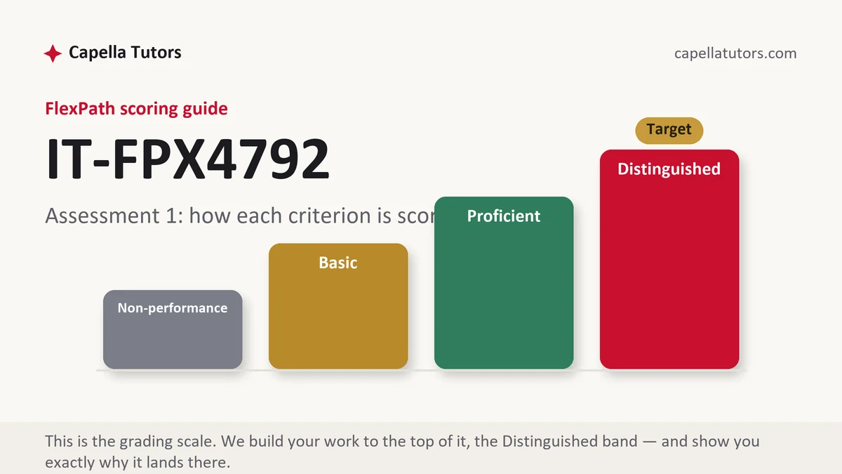
How IT FPX 4792 Assessment 1 is scored
There is no letter and no aggregate. Every criterion is fixed at one of four levels alone, and reading those four aloud is the fastest way to plan a draft:
| Level | What it means on an architecture and design deliverable |
|---|---|
| Distinguished | Requirements are written so each one has a visible pass or fail, the labeling scheme is defended in the words the audience uses, and the type scale, spacing and color set are stated as values with contrast measured. The criterion asks for one thing past consistency, which is a reason, and it says so. |
| Proficient | Audience, content and visual system are all present and coherent. Complete work that stops at what was chosen without saying what it displaced. |
| Basic | A sitemap and a mood board with preferences described as principles. Reasonable-looking structure with no evidence behind it lands here more often than incoherent structure does. |
| Non-performance | Something required is missing outright, most commonly the content inventory or any measured contrast value. The floor is reserved for absence rather than for thin work. |
Everything you build later reads from this document. The routes you write in the application stage should be recognizable in the URL structure you set here, and a labeling scheme changed halfway through the course is the source of most of the inconsistency marks lost at the end.
The IT FPX 4792 Assessment 1 method, step by step
-
Convert the scoring guide into a file list
Give every criterion an artifact: a page, a source file, a section of the report, a screenshot, or a measured value. A criterion with no artifact beside it is either work you have not planned yet or a mark you are about to concede, and finding out in week two costs nothing.
-
Write the requirements so a stranger could test them
Each requirement gets an identifier, a source, a priority and an acceptance test. A site that is easy to navigate cannot be accepted or rejected; a site where any published page is reachable in three clicks from the home page can be checked by anybody with a browser and ten minutes.
-
Inventory the content before you draw the navigation
List what actually has to exist, then group it the way the audience groups it rather than the way the organization is structured. A library patron looks for a room, a time and a capacity, not for the department that administers the booking, and naming that gap is a criterion answered.
-
Choose the labels from the audience's vocabulary
Test your labels against the words people use when they ask for the thing. Five people sorting your content into groups they name themselves takes twenty minutes and produces evidence, and evidence is the difference between a defended label and a preferred one.
-
State the visual system as values, not as adjectives
A type scale with sizes and line heights, a spacing rhythm with a base unit, and a color set with contrast ratios measured against their backgrounds. Then write the reuse rule, which is that a component is drawn once and used everywhere, and note where you broke it and why.
-
Give each significant choice a rejected alternative
Horizontal navigation with five items displaces the eight-item version and the drawer, so say what it displaces and what that costs. One clause naming the option you did not take converts taste into an argument, and the argument is the part that is graded.
A structure that maps to the criteria
Internal planning lengths for an opening design document rather than Capella rules; whichever criterion your guide weights most is the one to expand.
| Section | What it must do | Guide |
|---|---|---|
| Audience and purpose | Who the site serves, what each group came to do, the device and connection they arrive on, and the evidence behind those claims. | ~250 words |
| Requirements and acceptance | Numbered functional and non-functional requirements, each with a source, a priority and a test somebody else could run. | ~250 words |
| Content inventory and labeling | What exists, how it is grouped, the labels chosen, and how you established that the audience recognizes them. | ~300 words |
| Navigation and URL structure | The navigation model, its depth, the path to the primary task, and a URL scheme that reads like the sitemap. | ~250 words |
| Visual system | Type scale with sizes, spacing base unit, color set with measured contrast ratios, and the component reuse rule. | ~300 words |
| Rationale, limitations and sources | Chosen against rejected for each key decision, what is out of scope, and specifications cited by module with dates in current APA. | ~200 words |
Annotated sample excerpt
A paragraph our team wrote as a model for work of this shape. Read it for the moves, then rebuild them from your own audience and your own content.
Five branch staff and five regular patrons were asked to sort the county library's forty-one room-booking content items into groups and name the groups themselves, and not one participant produced the word Facilities, which is the label the current site uses at the top of its menu.1 Eight of the ten produced some form of Book a room, four produced Study spaces, and every patron treated capacity and equipment as properties of a room rather than as separate sections, which is why the navigation carries five items with Book a room first and folds equipment into the room detail page.2 The rejected option was the existing eight-item department-shaped menu, which keeps every internal owner visible at the cost of putting the primary task three levels down, and the cost accepted here is that branch staff lose the direct link they are used to and will need a short internal notice.3
- 1Reports a method, a sample and a result in one sentence, and lets the finding contradict the existing site. Evidence that surprises the writer is the most persuasive kind.
- 2Turns the finding directly into a structural decision. The criterion is looking for the line from evidence to layout, and here it is one clause long.
- 3Names the alternative, what it would have preserved, and who pays for the decision. A cost owned in advance reads as judgment rather than as oversight.
The full premium sample for your exact assessment, written fresh to your scoring guide and issue, is free to request. Study it, revise it into your own voice, and submit work you understand.
The five mistakes that cost Distinguished
- A sitemap shaped like the organization chart. Grouping content by the department that owns it puts the visitor's task wherever the internal politics left it.
- Requirements written as qualities. Clean, modern and intuitive cannot be tested, so they cannot be accepted later or graded now.
- Contrast claimed rather than measured. A ratio is a number a tool produces, and a sentence about strong contrast with no value is unverifiable.
- A type scale invented per page. Six sizes chosen by eye across four templates is the definition of an inconsistent system, and consistency is explicitly scored.
- Design decisions defended by preference. Saying a layout feels cleaner answers nothing, while naming the content it prioritizes answers several criteria at once.
Pre-submission checklist
- Each criterion in the guide carries its own labeled section
- Every requirement has an identifier, a priority and a runnable acceptance test
- Content inventory complete, with grouping evidence from real people
- Primary task reachable in a stated number of clicks from the home page
- Type scale, spacing unit and color set given as values, contrast measured
- Chosen against rejected for each key decision, specifications cited with dates, current APA both ways
Architecture document due this week?
Send the project brief and the criteria attached to it. Requirements come back testable, the content inventory comes back grouped with evidence behind the labels, and the visual system comes back as stated values with contrast ratios measured rather than asserted. Your opening premium sample is free.